Sunday, 15 November 2015

Walsall gallery.

Walsall Gallery.

Walsall gallery being the first of three I visited on the 11th of November. The gallery I entered was panelled from floor to ceiling in wood, this gave the illusion of height as the walls seemed to continue up through the building, this paired with the use of layering shapes in the architecture of the gallery creates an organic atmosphere which mirrored the nature of the pieces within the gallery.


One of the first rooms within this colossal gallery had many sculptures years old with some pieces even dating from the 12th century. At this point I took the opportunity to sketch some of the small figures in front of me and to admire some of the work by Jacob Epstein. His work dominated the room with his pieces geometric components and sheer size. The gallery not only featured some of his sculptures but also his paintings, both of  which portraying his abstract way of working paired with his very modern and contemporary style.


Following on from the Epstein exhibition there many smaller rooms filled with smaller paintings, with each of the individual rooms having a particular theme. Many of these paintings were portraits of influential people of the time, it was here placed next to the Epstein exhibition that the development of artistic styles could be seen from paintings of realism to Epstein's avant garde sculptures. 
The true star of Walsall gallery was up in the heavens of the building with the Mat Collishaw exhibition where everything including the lighting of the room added to the ambience of the experience. Collishaw's style is dark showing a more sinister side of human nature. The entrance to the exhibition was a moon away from the light airy section of the gallery in which Epstein's work was shown, but instead took the form a giant space with not ceiling lights and only smaller lights around each of his pieces to display his collection. The atmosphere and presentation of Collishaw's work is a huge part of the whole experience, the walk to the exhibition was up many flights of stairs with only nature light creating a rather organic but sinister nature to the journey as shadows were cast by almost every object in the hallways. At the base of the final flight of stairs to the Collishaw exhibition a single window stood and illuminated the whole corridor. This lighting was eerie and cold mirroring what was up another floor. Entering the insecticide collection by Collishaw I was met with enormous, hypnotic images of butterflies, moths and other insects almost exploding into a burst of vibrant colour. The display of these pieces was truly compelling with a background to the pieces being black, against a black wall and in a poorly lit room all of the focus as viewer was to the eruption of colour emitted from these images. Wings of dead insects added a translucent affect to an other wise bold image, representing in my opinion the delicate nature of life teamed with potent themes of death and destruction that is seen in the everyday world around us. The subject of the pieces being something so insignificant as a butterfly could be seen as a metaphor for us as a species that in the grand scheme of things we are as insignificant as a butterfly, but can create such a powerful force just like the vibrant nature of the images in an otherwise dark room. As the pieces within this exhibition were prints of the original pieces only a small glimpse into the vast amount of texture could be taken from the experience. Upon close inspection you can see where the insect meets an external force and the texture the impact creates.  


Within the insecticide series there was smaller glass cases filled with exotic plants, which looked almost alien. Following the almost rabbit warren layout of the mass of rooms that made up the exhibition I came across a empty room with a warning of strobe lights. On the ceiling and walls of the space were projected images flashing on and off at different places. Images of girls crying in the arms of large men and mothers holding their child's in pain flashed all around me. The emptiness of the room emphasised the graphic images that surrounded every wall. Similarly to the insecticide collection the theme of death and destruction is once again explored however through a different medium, the longer you were in the piece you began to see more and more scenes appear. As with this piece the idea is that you are alone in the centre of the room while the projection surrounds you, it becomes an extremely emotive experience, due to the isolation of a huge empty room and the dark nature of the pictures all over the walls. This piece by Collishaw is called deliverance, and is made by 45 gobos, 3 moving head projectors and phosphorescent paint. Heading up another flight of stairs attached to the insecticide collection was a single sculpture which may have been the most breathtaking of the whole exhibition. A rotating sculpture of a Colosseum creating the effect of a moving image with fast rotations paired with strobe lighting. This zeotrope 'wheel of life' portrays the biblical tale of King Herod's act of infanticide to protect his throne. The whole structure is comprised of 300 individual figures 3D printed from a computer model in resin, each of these meticulously placed to show an idea of an animation of many children being whipped and killed. As with the rest of the work in the All things fall exhibition atmosphere is incredible important, similarly to the other rooms the only piece of lighting comes from within the structure, the rest of the room is in darkness causing the eye to focus of the image spinning in front of you. The piece spins for a few minutes then comes to a Holt and is then lit externally enabling the viewer to appreciate the details within the structure.  Due to not being able to post videos onto the blog there is a link below to the post of the video on facebook.

https://www.facebook.com/imfineitsalljustinmymind/videos/1191795060835448/

Art wasn't just contained within the gallery but was painted all over the streets leading up to the building as well. From inside the caffe of the ground floor of the gallery I could see down a length of canal next to which was teamed with rather worn brick walls covered in graffiti. I took this as an opportunity to explore the artwork. Many were just words which in true graffiti style were difficult to read but others were truly beautiful drawings. 


As with my previous trips to the new walk museum I did some observational drawings whilst walking around the gallery, I also made notes on the images that I like and quotes that I found interesting. 


'Simon Raven 2012 camden arts centre bookworm'
'Jacob Epstein 1880-1953
watercolour and pencil n paper 
messenger for the creation 1930'

'Jacques courtois known as Il Borgognone 
1612-1675
battle scene 
pen and ink'

'William Geer 
Landscape study 1959
oil on canvas'

'Geoffrey Ireland  
In progress portrait 1950's 
photograph 
depicts an unfinished painting'

'Jacob Epstein 
nan the dreamer 
1911
bronze'
https://www.google.co.uk/url?sa=i&rct=j&q=&esrc=s&source=images&cd=&cad=rja&uact=8&ved=0CAcQjRxqFQoTCOntm4CHk8kCFUE5FAodUUwDZw&url=http%3A%2F%2Fpictify.saatchigallery.com%2F593097%2Fnan-the-dreamer-by-jacob-epstein&psig=AFQjCNF2X08r9zb8hV06--HXIt-HfY6yuQ&ust=1447698412893098

'Emile Schuffeneck
1851-1934
girl knitting 
pencil'
http://www.chrislee.org.uk/inspiringcreativity/GR232%20-%20Emille%20Schuffenecker%20-%201851-1934%20-%20Girl%20Knitting.jpg

'Towns of the unexpected 
francis bacon'

Sunday, 8 November 2015

Signs Robert Rauschenberg

Signs Robert Rauschenberg 

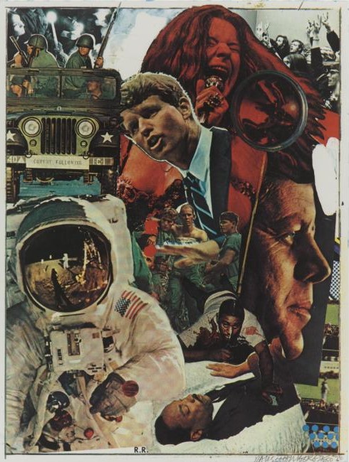
The piece ‘Signs’ is a collage by Robert Rauschenberg in 1970. Born in 1925 at the time of this piece Rauschenberg was 45 years old at the time, and would have been heavily influenced by the prominent issues of 1960-70’s America. At the time of the Space race, the Peace movement, troubles within the Race Relations and nearing the end of the Vietnam war, America was a turbulent place to live in. Signs makes a broad and controversial statement about the American government and the way that many people saw it but didn’t want to say, many of the people depicted within the piece are now dead, multiple subjects in the picture including John F Kennedy and Martin Luther King were assassinated and their deaths seen as a conspiracy.
The piece is a flat 2d portrait composed of smaller individual images, some with white borders to make the separation apparent. The collaged images within are iconic photographs of the time probably taken from magazines, each depict the significant social make-up of the time. With a busy composition, the image is then balanced by a heavy base to the image with the largest individual pictures at the bottom, the largest of which being the image of the astronaut. At the time of the image there were many things that the American Government didn’t want to disclose and if they did, things were often put into place to take away from the severity here the joyous occasion of winning the pace race. Here Rauschenberg has fabricated that idea by depicting a lot of images with negative connotations, such as the dying man crawling out of the centre of the piece, or Martin Luther king being shown in a coffin and disguising them with an American victory putting a man onto the moon. The second largest individual section of this composition is the use of JFK’s head. Rauschenberg was friends with the Kennedys due to his powerful influence in pop culture, several years before this piece Kennedy was assassinated, being an obviously upsetting and personal time to Rauschenberg he chose to make a statement by using Kennedy as a focal point in the collage. In turn drawing the audience’s attention to what was really happening in society and the fact that even though it was trying to be covered up by the government, much like the overlap of the astronaut in the piece it was a real and emotional event.
Formal elements of both colour and line is also heavily used throughout the piece, Janis Joplin Is placed at the very top of the image in red, being the only section of an individual hue the eye is drawn to this part of the piece. The Peace movement, and the heavy use of hallucinogens was something very prominent in the sixties and this aspect of society was portrayed through the influential presence of Janis Joplin. The complementary pair of colours green and red are used in this piece to fabricate a diagonal line through the centre of the image. A selection of images in the secondary colour green contrast the red and shows the brutal nature of war by portraying pictures of army men, beginning with a truck at the top left hand corner, to a group of soldiers hugging in the centre to a dead solider crawling out of the image. Within the centre of the group of soldiers hugging there is a large and slightly out of focus hand maybe trying to portray the involvement that the American government has in the decisions of what happened during the Vietnam war. This hand is external from the image and looks out of place and awkward, this may be a direct comparison made by Rauschenberg about how he feels the Government’s is involvement with the troops in war. These create a separation between the warm harmonies of colours created by the image of Janis Joplin and Kennedy and the cool colours of the astronaut and Martin Luther king. This creates a juxtaposition, reiterated by the complementary colours, between the dark aspects of society that led to assassinations, sacrifices and deaths of innocents and the positive light that we put man on the moon. This divided within the collage creates a path for the viewer’s eye to follow, we are guided through the image by meticulously placed colours and images, telling a story of Rauschenberg’s true opinion of the state of his homeland. The collage Signs has a very flat appearance with lack of texture this has probably been chosen by Rauschenberg as the range of powerful meanings in the image and the busy composition is already quite a lot to take in on initial viewing so the addition of texture would take away from all the carefully chosen messages already there.
Upon studying work by Rauschenberg and reflection on the collages I have recently been creating, I feel that I could add a vast amount more meaning to my pieces. With each individual subject in Rauschenberg’s collage there is a specific meaning and reason to it being there. In each of my pieces I have realised I’ve just added section for the sole purpose of appearance and not to develop the meaning behind the piece.

Sunday, 1 November 2015

Research on objects.

Research on the objects portraying the theme of texture.

To begin my research over this half term I decided to change the subject of my observational drawings to something with more texture and that would have a stronger ink to the overall theme of faded, trace and memories. As it is nearing closer to the remembrance day and a period of time that holds powerful memories for thousands of people the poppy is a trace back to this time for the masses. I was lucky enough to have poppies in my garden, in many stags of their development. I used this to my advantage and took these variety of stages in the life of a flower to develop an understanding off. Before starting observational sketches of the poppies I took pictures of all of the individual buds. 
These two images are both at the first stage of the poppy, the bud before they flower. At this stage the poppy hows a great deal of texture as the tiny hairs that cover the plant. these hairs are there as protection for the plant, both keeping the reproductive parts of the plant insulated in the colder weather, and as a protection against animals that attempt to feed on them. These hairs, only around 1mm in size are generally quite difficult to capture when drawing as I found when I was completing observational studies on these plants.
These next three pictures are the stage in-between budding and flowering. At this point a new dynamic is added to the plant as leaves begin develop. The top of the bud also becomes to rot and change colour and it pulls away from the flower inside, this adds to the variety of colours within the plant making it a more interesting subject to draw. As with the previous stage of the plant the whole thing is covered in tiny little hairs. This creates a juxtaposition between the delicate flowers poking through, the wilted nature of the outside of the leaf and the sharp looking nature of the hairs. 
These two images show what is left when the flower of the poppy dies away. The top of the seed pod creates for an intricate shape where the centre of the seed pod become a vanishing point. This stage of the poppy has vast contrast between the very dark top surface which is rough and raised to the very smooth and soft sides of the pod.
In this last photo of the poppy I cut inside a bud of the poppy to reveal the delicate pink petals inside. By leaving the inner pink exposed but still having the bud around it fabricates the illusion that the petals are emerging naturally from the pod much like it would do over time if left to its own devises.
After studying both of the picture of these poppies and the plants in front of me I completed some observational drawings based on mainly the second stage of the poppy. I mainly focused on the second stage of the poppy as it showed both the contrast in colours from the rotting skin to the flower inside and also the contrast in textures.
I found when completing the initial sketches it proved difficult to capture the tiny hairs on the surface of the poppy. I used the technique of using a rubber to rub away tone and to drag tone out of the image in order to create the idea of the hairs on the surface. I used the technique of cross hatching on the biro sketch which worked well as the nature of this is quite scratching much like the texture of the hairs and many lines together make a smooth texture, much like how when many hairs join together on the surface make the pod look smooth. I feel that the charcoal sketch was the most successful image, however it would have benefited from a white chalk as the actual poppy doesn't have a harsh outline similar to how I have portrayed it.
After completing these sketches I chose to revisit the techniques learnt in the collage lesson. Following the same steps as the previous lesson I completed two collages.    


I chose to do two collages in this style as they create a vast amount of texture mimicking the the textures of the surface of the poppy. By working onto a wet medium you develop a range of shade, depending on how wet the surface is, making this a fairly quick technique. I also find with working in this style the quite expressive nature of the image makes it a rather interesting piece to look at as your eyes travel with not only the general trend of the line but the shape of the collage. It also produces a 3D image with the raised paper created from pulling paper room from the page.
I intend to carry on studying texture throughout my work as it lends it self to trying many different mediums which could be beneficial when choosing the style for my final piece. I also enjoy studying poppies for their deep connection to the soldiers that have fought for our country.They are very intricate subjects and could be very suited to many different mediums. As the poppies I am studying are fresh flowers I could encounter the fact these particular subject may wilt and die and no longer give the effect I desire. 

Friday, 30 October 2015

New walk museum.

A trip to New walk museum in Leicester.

During this week I visited New walk museum in Leicester after a friend suggested I take a look at the collection of German expressionist pieces this museum is known for. The history behind the exhibition is a complicated and unique one. The museum has the largest collection of German expressionist pieces outside of Germany, how they arrived here was particularly interesting. When the paintings first came to England they weren't, as such, meant to be here and were brought in on the down low. Like in many cases within the art community, exhibitions and individual pieces can be seen as quite controversial, these pieces often make for the most interesting.

Before even entering the museum you are greeted with art literally at your feet. Within the pavement outside of the gallery there are butterflies and other insects encased in glass between the slabs. Giving an insight of what the inside of the museum has to offer, as within the museum there is a large collection of fossils, bones and preserved creatures.

Before entering The expressionist exhibition, there was a collection of artefacts from all over the globe. It was at this point I took minute sketches of some of the objects in the cabinets. As they were reasonably quick drawings they only give the general impression of what was in front of me, however looking juvenile and messy. I also took some pictures of some of the pieces within the room. However it was also at this point I was rather strongly warned about taking photos within this section of the museum, especially the pieces of Picasso ceramics.

Before travelling to the museum I looked on the website gallery at pieces that I was interested in and some of the artists featured in the collection. The artist Franz Marc stood out to me with his use of vibrant colours and unusual form within his pieces, and this I was rather fond of. As I couldn't take photos within this exhibition I collected two of the booklets on offer about the pictures I liked within the selection. One on Marc's Red women, which within Marc's work is a rare piece showing a figure rather that his usual subject of animals. The hair of the figure within almost blends into the subtle foliage of the background, Marc was a strong believer that art was significant, and everything within a picture had particular meaning. He also wanted to explore humanity and their harmony with nature, using both colour and form. The blue and greens of the image that blend with the woman are spiritual colours, maybe trying to illustrate a biblical image, both portraying a naked women and a 'green' connection to nature  

The second booklet I collected was on Ernst Neuschul's iconic piece of Messias (1919) oil on card.This image is displayed on the entrance to the museum and takes pride of place in the expressionist ensemble. The piece is controversial like much of Neuschul's work as he tried to portray the inequalities within society and had a history of difficult situations within the artistic community. In 1939 in an exhibition in Czechoslovakia his paintings were slashed and defaced with swastikas.This piece is a very early self portrait, and with the title of messias which is the Arabic word for messiah,it showed Neuschul's belief in himself and his artwork. He makes himself the true focal point of his own image, reiterating this to the audience by having his own figure in the image point to his chest. This powerful gesture, paired with the strong facial expressions made prominent by the sparse background, truly convey Neuschul's ideologies and personality. 

In this section of the exhibition a projected image was shown on every wall, of many of the pieces and their history, many of these were in black and white and not detailed images but simple line drawings that were prominent within the collection. A serene type of music was paired with this. The use of a visual 3D display paired with the element of sound to portray a particular theme, gave the exhibition a hands on feel as you walked through the experience, while looking at all the pieces surrounding the walls.

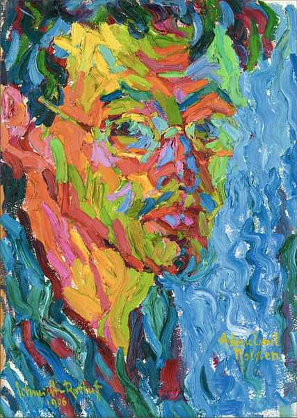
While walking around this section of the gallery and the other smaller exhibitions showing older more realist paintings of beautiful landscapes and the very abstract expressionist pieces, I took notes on the paintings I enjoyed. Within these notes i took down the artist, the size of the piece ( if available), the mediums used, the title and when the piece was either printed or produced. By doing this I have created a glossary of paintings, artists and techniques for future reference to use in my artist research and inspiration for future pieces of my own. 

' At the fortune tellers
 Paul Kleinschmidt 1883-1949
Etching and dry point 

'Blind Man 
Otto Dix 1891-1966
Lithograph 
Printed in 1923 '
' Stormtroopers advancing under gas
Otto Dix 
Etching and aquatint
Printed in 1924 '

'The March into the unknown
Max Slevogt 
P1.1 From visiovo 1916-17

'The Yellowstone Falls
Edmund Marriner Gill

'Portrait of a Man
Karl Schmidt-Rootluff

The next image is mainly of a quote shown in a description of the artist Winifred Nicholson.

'Winifred Nicholson 
Crystals 

"The nature of abstract colour is utter purity - but colours wish to fly, to merge, to change each other by their juxtapositions, to radiate, to shine, to withdraw deep within themselves."

'Frank Howling 
Lguanagone
Acrylic on canvas'

After looking around the exhibitions involving 2D images I ventured into the part of the museum with models of dinosaurs and old fossils. At this point I stood in front of one of the largest dinosaurs structures and drew some of the details I could see at the joining of joints and different bones within the statue. These drawings are once again quick sketches, and the next museum that I go to I plan on spending more time on each sketch and making them slightly larger to allow for a more expressive nature of drawing. I also included a small section of Hieroglyphics, I could only capture a small section of the total piece as it was closed off for a lesson. 


At the end of my time in the museum I collected a small selection of postcards with the two pieces that I previously looked at and other pieces of artwork on. I plan to visit more museums and carry out a similar style of working for each one,building a small portfolio of each one in a collective sketch book to document visits. I also picked up at the museum shop a book on one of my favourite artists, this was a personal purchase. However her work is based around many circumstances that the main exhibition showed. Kathe Kollwitz' work is based around the Weimar Republic and the devastation that brought to Germany. an issue that is show as a trace is many of the expressionists work in the collection at New Walk. There were many graphic images showing nature of warfare and conflict which are all the artists memories and personal experiences of early 19 hundreds Germany.


Links to images found in New Walk museum.

Sunday, 25 October 2015

Collage lesson. Annotations 3 using different shades of one colour.

Collage lesson.

Third use of collage using different shades of one colour and layering to show the nature of the subject.

I began in the same way as my previous collages by tearing up sections of tissue paper, this time using multiple shades of green to portray my subject. The layering of different shades of green make the outcome of the collage much more vibrant and eye catching. I used the same techniques as in all the other collages however when layering emulsion onto this piece I used slightly more, making for a pastel colour over the lighter shades of green. Below are step by step photos of the first stages.

I then proceeded to draw onto both collages, the leaf I chose for the subject of these pieces had many segments, due to the texture of the collage this was shown quite well through this piece. I also worked back into this image with small pieces of tissue paper similarly to the last collage I completed as I found this to be very successful in my last attempt.
I also worked back into the second collage, with the way I had glued the ripped pieces onto the second piece it reflected the shape of the leaf so I followed this shape with charcoal. As with my last drawings with this second collage it was hard to follow where the charcoal was over the drawing. I think this takes away from the quality of the piece as it looks unfinished and bare. However after completing many attempts of this technique in this style I have learnt that selection of background is incredibly important to the quality of the finial image.