Saturday, 2 January 2016

Working on a larger scale.

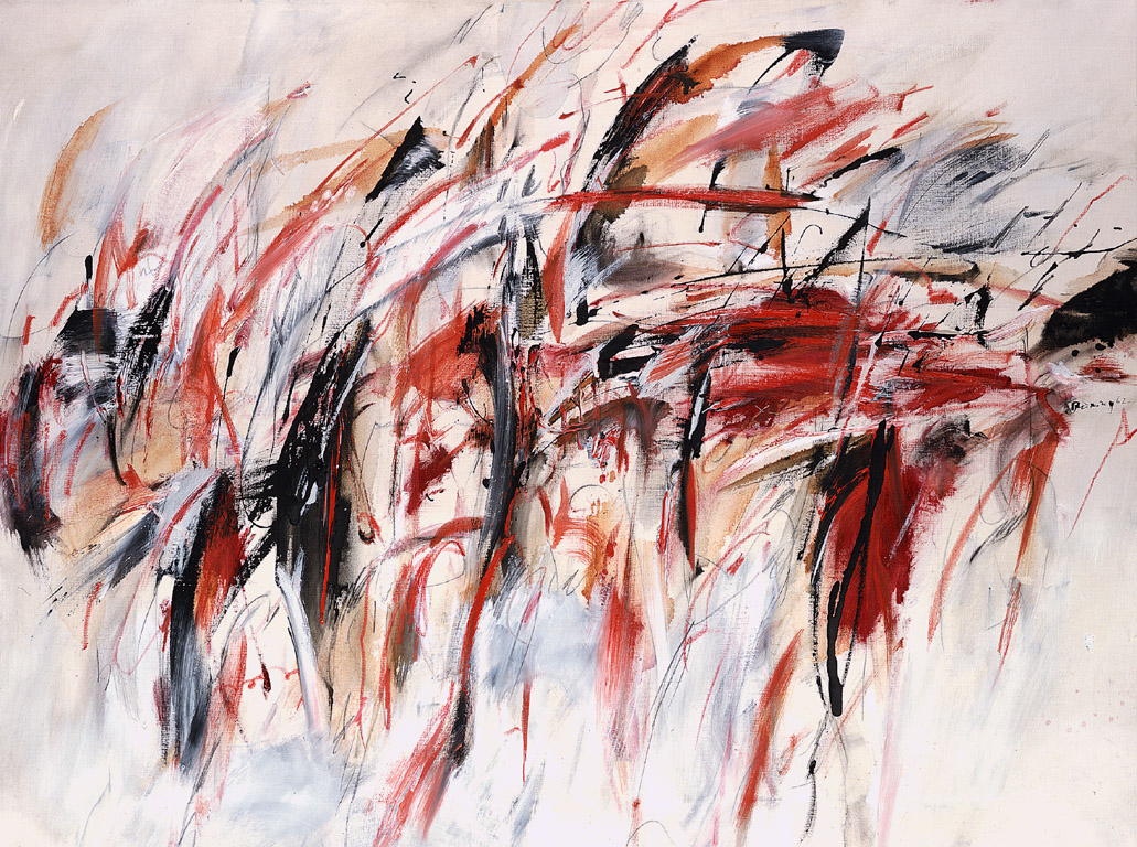
Acrylic experiments on a larger scale working with inspiration of Peter Brüning. 


After experimenting in my small sketchbook with the ways in which acrylic can be applied to the page to create an abstract style which was inspired by sections of Brüning's 'Onhe titel'. I applied the acrylic to the page with ripped pieces of cardboard, by doing this it allowed the paint to drag across the page in a rectangular manner. The rough texture of the cardboard removed some of the paint underneath and blended it with the colours being added to the surface, it also allowed for washes of colour to be added over the top of the work. As the cardboard became saturated with paint, colours began to merge and create new hues, this meant after a certain period of time using the same piece of cardboard you have to use a new section. This in effect means to create a larger scale image a lot of cardboard is used through the process, to create a similar effect a pallet knife could be used, as the edges of the knife mimic the nature of the cardboard. I completed a few of these smaller scale images, with the red image seen above turning out to be the most successful due to the high contrast between the darker brown shades and the vibrant red. 


The first stage of the stretch, size A1.
 
It was at this point I decided to complete an image on a larger scale. Firstly choosing to work A1 as this is the largest size available to me, this would also allow for a more expressive style of work. When making a stretch the paper must damped with a sponge and laid on the board. Working quickly damp gum tape must be added to each side of the paper applied with a lot of pressure to ensure a tight stretch. When the paper dries it should be tightly stretched onto the board making it easier to work onto paper that doesn't crease or move. I did find that when I was applying a layer of emulsion to the page as a base and to add texture the paper bubbled and when it dried there were slight creases, I put this down to a poor stretch as it was the first time id ever done this style of work. 


After letting the base of emulsion dry I started to work into the piece with acrylic and cardboard in the same style as in my smaller sketchbook. Working on a larger scale allowed the marks I made to be a lot more expressive as I had further to go on the page. Through working with different marks I learned different combinations of marks that I thought made  for a satisfying image. By dragging a thick amount of paint vertically across the image then taking the side of the cardboard across this made an almost tree like figure. Working with this as a main aspect of the piece I ended up developing a piece that had its main bulk at the centre of the page then these sharp spikes of colour extending the piece further from the middle. 


The final outcome of this image.
After completing the main two thirds of the image I decided that this image could relate to the theme of faded and traces with the transition of colours from mainly dark hues with a compact and dense composition. At the other end of the image a brighter and less dense area of paint. In this way the idea of a once strong memory fades into a less prominent memory which may get altered over time as you recount it, here shown with the changing of colours. When completing this image I feel I could have made this message stronger if I had added complementary colours which if I completed this style of image again I would add complementary colours to make a more vibrant image. I particularly like how this image mimics an explosion however I did feel that when the gum tape was removed from the board, the blank space left where the tape was made the piece look awkwardly placed on the page. To counter act this I took a scalpel and trimmed the edges of the page as close as I could to the areas of colour, this made the composition of the piece slightly better as the image seemed to fill the area of the paper. 


As the theme I was exploring before i looked at abstract expressionism was texture applying a base of emulsion to my stretch made for a vast amount of texture on the papers surface. By using cardboard rather than a brush to apply to paint it made areas of built up paint creating almost ripples in the paint. By taking a clay tool to areas of the paint when it had dried it allowed me to remove some of the paint creating a rough texture which contrasted with the smooth ripples created by thick acrylic. I was initially going to work back into this piece with glue and acetate like what i had been experimenting with previously in my sketchbook however I was happy with the way this piece looked without the addition of more texture. However I plan to complete another larger scale piece and work back into it with different mediums. 


Over the holidays I didn't have to ability to complete larger pieces on board and so i could only paint smaller paintings on A3 sketchbook paper. It was then I understood how much having the paper stretched to board helped. Painting onto paper that wasn't attached to anything made it difficult to get the same type of fluid motion without the paper ripping, using different paper also meant that my paper was saturated and became hard to work on. However I did explore the use of colour more in these pieces, using complementary colours such as purple and green, this made the image slightly more vibrant. The acrylic paints I used weren't as high quality as the ones I used at college which also took away from the colours used in the image. I do not think that this image was as successful as the previous image, however I do think the use of complementary colours aided the overall image even if outcome wasn't as successful. 
 
I plan to complete more larger scale images and plan to mix media to add to the overall texture of the images. I also want to make the images more personal to me as these two pieces weren't based on any particular emotion or memory and I feel that if I focused on a specific event it might aid the overall effect of the piece. 

Tuesday, 8 December 2015

Experiments with acrylic on acetate.

Experiments with acrylic on acetate.


Ohne Titel, Peter Brüning, 1959 oil on canvas
While working in the style of Peter Brüning and taking inspiration from his pieces such as Ohne titel I have looked at how expressive marks can be made on acetate with acrylic paints. I completed an observation drawing of the piece shown ontop of the piece nr 100 printed on acetate.

 I had previously explored the way acrylic looked on acetate and the use of a dry brush created brush strokes similar to which seen in Brünings work. After completing an observation piece of a small section of Brünings work on acetate I decided that I wasn't sure which way the piece looked best. Wether the acrylic on the surface where brush strokes could be seen, or place acrylic down to the page so only the colour showed through and the original colours of nr 100 could be seen. It was at this point I decided to look at the acetate through a light box and see the effect the light shone on the piece would have.

Acrylic facing up
Acrylic facing down
With the acrylic painting facing upwards the strokes of the brush can be see, when working on top of acetate the brush used must be completely dry as water will simply run straight of the plastic surface. This makes the paint applied look dry and every hair in brush can be seen in the strokes of the paint. By having the acrylic facing upwards then small pieces of the Nr 100 (Brünings piece printed on the acetate below) are covered by the paint. When having the acrylic facing down towards the surface a completely different style of image is fabricated. Small sections of the acrylic can be seen as undertones through the acetate due to the transparent nature of the medium. It also means the entirety of Nr 100 can be seen. Due to the piece having green tones through ( a complementary colour to the red used in the observational painting) a very vibrant image is created. However by laying the acrylic down to the surface, the dry brush strokes which mimic the work of Brüning cannot be seen.

Acrylic facing down.
Acrylic facing up.


By using a light box the stokes of the acrylic can be seen either way that the paint is facing, which means that the main idea of the green of Nr 100 showing and the brush strokes that were hidden when this was the case can be seen.

By printing the images of the acetate on a light box onto acetate it allows me to show the brush strokes of the acrylic while also showing the colours of the Nr 100. 

Friday, 4 December 2015

Oil pastel transfer.

Oil Pastel transfer


The initial layer of oil pastel on cartridge paper.
To complete an oil pastel transfer an observation study must be completed. By looking at the object in front of you and analysing the main hues and slight tones seen and completing a base of these combined, creates the colours seen in the transfer. Firstly layering the tones that can be seen in the object creates the main section of the piece, this should be down in a brash manner as this isn't the sketch of object just the basic observations. Laying the side with the saturated oil pastel face down to the page an observational study of the object can be completed. Pressing firmly onto the back of the pastel a transfer of the drawing should be projected onto the page underneath. 


After completing this transfer I discovered I hadn't initially put enough pastel on the first layer of tones. To improve the strength of the transfer I layered a vast amount more pastel onto the page, once again using the technique of looking at tones in my object to create a collage of colour. This time the transferred image was a lot stronger in colour than my first attempt at this style of transfer. 


This technique creates a juvinelle image and this style of observation studies doesn't work with the abstract expressionism that I have been studying currently and therefore I don't think I will purpose transfers in this style. However the oil pastels themselves act as a transition to oil paints with similar characteristics to oil paints which is a common medium used in abstract expressionism. By using the oil pastels I get used to the medium of oils in a slightly more inexpensive and forgiving manner. 


Monday, 30 November 2015

Analysis and comparison.

Analysis and comparison of artists found within the theme of abstract expressionism.


Testament, oil on canvas
40x30x0.5 inches
During this week I discovered that the work I had been mainly interested in, from pinterest and books within college was characterised under abstract expressionism. Armed with this knowledge I chose three artists that fit with this style of work. The first artist I looked at was Simon Kenny, an abstract artist from Dublin whose work shows a combination of both the ideas materialism and spiritualism with his use of both colour and form. His pieces are designed to trigger emotion that may have been suppressed over many years by allowing the paintings to build and develop their own connections to the viewer as they are not based on any specific time or place. By taking this idea and applying to our theme it allows me to create an extremely expressive piece that may be based on a memory of my own but would allow people to make their own connection to my work, creating an idea of interaction and personal connection with my work. Another key characteristic of Kenny's work is the viewers opinion of the piece and the flexibility that comes with that. Some of his work may at times look harmonious and tranquil and invoke memories of happier past times if at the time of viewing the painting you found yourself in a peaceful mood. In contrast to this his work could also be seen as graphic and violent, due to the way in the which the paint collides and could invoke memories of painful experiences. Kenny's ability to depict an image that is so dependent on the audience of the piece fascinates me and is something I would like to portray through my own work. The image to the right is testament by Kenny I was particularly drawn to this piece due to large section of pale hues dominating the image from the left top corner and flowing through the piece, and the separation created by the harsh contrast on the darker tones at the base of the portrait. The form of the image is a portrait, the composition of the painting is balanced due to the heavier tones being mainly at the base of the image. The focal point of the image is fabricated by the illusion of crashing waves where sections of the two tones seem to merge together, at this point of the piece the main section of colour is seen with blue and red hues collide. As these two primary colours are complementary it causes the readers eye be drawn to this point of the painting. The use of oil paint and Kenny's use of a pallet knife to apply the thicker ripples of paint, this links to the work I've been creating in collage with the uses of texture, mainly created by the burning of acetate and cello tape transfers, as these create bubbles and folds within the plastics mirroring the thicker areas of oil paint.
  

James Brooks ‘Boon’, 1957
©  Estate of James Brooks/VAGA, New York and DACS, London 2015
Boon 1957, oil on canvas 180.3x173 cm.
The second artist I decided to look into was American artist James brooks his work being far more abstract than Kenny's with expressive and rhythmic brush strokes with contrasting patterns and very little form in the mark making unlike Kenny's almost scenic style. His work developing a brash and almost chaotic nature, mirroring the work of his friend Jackson Pollock, in the 1940's with the rise of abstract expressionism in a post world war II America. With a fairly dark yet juvenile nature to his pieces, fabricated by large areas of block colour his work takes on a rather expressive mood. The piece Boon was one that particularity stood out to me with the large amounts of contrast between the light yellow hues and black tones. Brooks described boon to be completely improvised and when listing the mediums used within the piece mentioned that there may have been traces of substances such of rabbit glue but he couldn't be sure, the experimental and unplanned nature of the way the painting was constructed is mimicked in the picture. A rather uneasy feeling s fabricated when looking at this piece, in my opinion the particular tone of yellow used within the piece looks rather out of places with the other wise clinical paler hues in the image. The vast amount of black that dominates the piece also fabricates the illusion of a sinister mood as the dark shadows of the piece paired with the brash nature of application cause a chaotic finish to the image. Similarly to the work by Kenny oil paint has been used on canvas, looking further into abstract expressionism this is something I have noticed is a common media. The bright colours created with this type of paint gives a different feel the way more liquidous paints would leave, the vibrancy of the colour and the viscous nature of the medium is shows through with every brush stroke. 

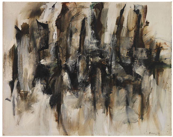
Peter Brüning - Ohne Titel
Ohne Titel 1959 oil on canvas.

On a very different scale to both Kenny and Brooks, the third artist I chose to look at was Peter Brüning whose work is on a smaller scale to the work of the others artists i have looked at. Brüning works on a smaller scale in order to allow for a more expressive nature to the way his paint touches the surface. As when working smaller even slight movements can change the whole dynamic of the entire composition. As an Artist Brüning belonged to the 'art informel' which was used to describe abstract pieces of work as more gestural pieces. The lack of a subject which is common to most abstract and expressionist work allows the audience to decide on what they believe is the true muse of the piece. Within a lot of Brünings work his pieces have a sharp and fragmented style, his use of gestural work makes the main composition of the piece to be created through the quick movement of his hands. A common characteristic of Brünings work is the idea that the painting is framed by the rest of the surface with the main bulk of the piece occupying only the central line of the surface. In the image Ohne Titel seen above the idea of line is illustrated through the use of a dark brown tone being pulled through the image, mimicking the idea of figures in a crowd. To me the piece could show a crowd scene as many of the expressive marks made by the paint create the idea of figures. A lot of the paint within the piece is muted by the addition of white oil paint this blurs the main gestural marks and in doing so gives motion to an otherwise stationary piece. A warm harmony or colours is used in this image with black, brown and orange hues which also adds to the idea of a crowd this mimicking the idea of peoples faces in a crowd. 


Verve
Verve Simon Kenny, oil on canvas 36x24 inches.
Both brooks and Brünings work takes on a far more expressive style than the work of Kenny. I like how that style of work allows for a more free flowing style of painting allowing for the true characteristics of the medium to be shown, this is something i would like to explore further. Within the studio I have already looked at the way emulsion can be used in such a way that expressive movements create a fluid type of appearance this could be something I could use in my experiments with working in this style. Kenny's work out of the three is much more controlled, and structured many on his images take on a surreal idea of landscapes. The way he uses the medium of oil paint to look like crashing waves or winds through forests, would mean that when I experiment in his style it would be a good idea to use a landscape image or multiple photographs to inspire the piece, this could link with the idea of memories as I plan to use photographs from my childhood or family to inspire pieces.
Ohne Titel oil, Peter Brüning.
Bound
Bound Simon Kenny. Mixed media 40x30 inches.
Both Kenny and Brüning use colour in similar ways using complementary colours to create a chaotic feel to the painting. Similarly using the main sections of colour in the centre of the image makes the viewers eye be drawn to the centre and from there is taken on a path through the image following the direction of colour through the piece. By looking at abstract expressionism I have realised that I haven't experimented much with colour within the studio and briefly touched on the idea with mainly oil pastels or chalk. To be able to complete a strong image in this style that is something I would have to explore more thoroughly. Using the ideas that I have looked at in the studio by looking mainly at undertones of objects and photograph and creating a piece with sections of these colours is something that relates to the work of these artists. As with their work there are bock sections of colours mainly complementary many of these could have been tones of the muse of the image.

Monday, 23 November 2015

Biro and hairspray transfer.

Transfer techniques - Biro and hairspray.

The second transfer technique I explored in the transfer techniques lesson was Biro and hairspray. This allows for an observational drawing to be aged quickly as the hairspray morhpes the image by separating the ink in the drawing and allowing it to bleed down the page. With this technique you also create a ghost image on the back of the surface the drawing is on. 
The first piece i drew was an observational line drawing of a dead leaf, this allowed for a fair amount of Biro and line due to the many fold with the contorted leaf. I chose to complete the image in a rather abstract manner to add to the hazy and distorted effect that this technique creates. When spraying the hairspray onto the image the distance of the spray changes the intensity of this effect. By putting the hairspray close to the image the ink separates a lot and drips down the page taking the ink with it, creating drips down the page. Holding the hairspray further away lightly changes the colour of the ink but doesn't distort the shape of the drawing. When spraying the hairspray the page behind the image becomes translucent allowing light to come through the piece, while holding this up to light a sort of hidden image can be seen. This translucent image could be then traced or copied while wet to develop the image.
Biro after the hairspray was applied, creating a hazy and warped effect.
when held up to the light the hairspray creates a transparent effect to the page. This fabricating a hidden image when the piece dries, for example here a figure can be seen in the hairspray.


After spraying the piece with hairspray a ghost piece is transferred on the back of the paper. Only sections that the hairspray touched is transferred this creates a fragmented image. 
By experimenting with different colours of biro I was able to see how the colour effects the amount of ink that runs within the piece. With black ink the hairspray causes a separation in colour and purple and blue hues run from the pen. Using red ink there is very little colour disperses from the original piece, by taking this into account it could be exploited when used as a developed transfer technique. 
This style of image could be used within a layering type of collage to add areas of different texture to the piece. The hairspray in effect  makes the paper thinner and bobble and the surface which if to be painted on top off could create an interesting texture as the paint would pick up on the uneven surface. 


Artist research.

Artist research

Abstract expressionists


Jackson Pollock - Number 23 1948

Jackson Pollock ‘Number 23’, 1948
© ARS, NY and DACS, London 2015


Sam francis - Around the Blue

oil and acrylic on canvas 1957-62  

Sam Francis ‘Around the Blues’, 1957–62
© Estate of Sam Francis/ ARS, NY & DACS, London 2015

Willem De Kooning -

The visit 1966-7

oil paint on canvas

Willem de Kooning ‘The Visit’, 1966–7
© Willem de Kooning Revocable Trust/ARS, NY and DACS, London 2015

Landscape at Stanton station 1971

Lithograph on paper


Willem de Kooning ‘Landscape at Stanton Street’, 1971
© Willem de Kooning Revocable Trust/ARS, NY and DACS, London 2015

James brooks

Boon 1957

oil paint on canvas

James Brooks ‘Boon’, 1957
©  Estate of James Brooks/VAGA, New York and DACS, London 2015

Franz Kline

Meryon 1960-61

oil paint on canvas

Franz Kline ‘Meryon’, 1960–1
© ARS, NY and DACS, London 2015

Robert Motherwell

Poet (1) 1961

Lithograph on paper
Robert Motherwell ‘Poet (1)’, 1961
© Dedalus Foundation, Inc/VAGA, New York and DACS, London 2015


Martyn Jones

Mouthing streams

oil on canvas 200x290 cm

… mouthing streams

Paul Barter

130204

mixed media on board 65x122cm

130204

Liz Pannett

14.1.79-8.80

 Acrylic, chalk & charcoal on paper 88.6x63.7cm

14.1.79 – 8.80


Tuesday, 17 November 2015

Cello-tape transfer.

Transfer technique lesson - Cello-tape transfer.

The first transfer technique I explored during this lesson was the cello-tape transfers. This transfer creates a translucent image of a photograph on cello-tape. This transfer relies heavily on using the right type printer or photocopier, using ink jet printers instead of using laser printers the image simply disintegrates when adding water to the image. 
Tape layered over a photocopied image
of a previous collage.
To begin the transfer a laser photocopy is taken and cello-tape is layered over the image, picture side up. When applying the tape it is important to make sure that there is a slight overlap between the strips as without this the tape pulls apart further on in the process. It is also important that there are little to no air bubbles as when the image is transferred this creates gaps in the image creating a section of blank space, however if this technique was used to age a picture this is something that could be taken into account as old photos gradually lose part of the image as they age. When this is complete a shiny layer is left over the photocopy.
The next stage is where it would become apparent if an ink jet printer is used. Taking a damp sponge to the back of the photocopy, gradually rub away the paper on the back. Ensure that the sponge is fairly damp while doing this as it makes the paper come away far easier. through experiment with this technique I found it works better to rub with the grain of the picture, meaning to rub in one direction as then it avoids accidentally pulling sections of the copy away. At this point you should see your image appearing through the gap where paper has been removed, it is important to note that images with a vast amount of white or light grey tints will rub away completely leaving the transparent tape, this is good to show high areas of contrast within a photo. When all the paper is removed a fragile and translucent copy of your image should remain on the tape. 

Image beginning to emerge through the paper at beginning of transfer.
transfer lifted to the light to show where sections of pale hues had become transparent.

   In my first attempt at this technique I developed a rip in the transfer, I put this down to the cello-tape not overlapping much at this intersection creating a weak point, which was then weakened by heavy handedness at removing paper. This is when I also discovered following one direction when removing paper worked better as no rips occurred following that technique.
To show the transparency of the technique I painted a bright yellow underneath the image to contrast against the red tone, to further this I could pair this particular image with green ink as green and red are complementary colours. I also smudged the colour on the page with a sponge and took some ink away to add some variety to the marks on the page. I do think the image was successful as the bright hue underneath the transfer made the pattern on the tape stand out more, it also emphasised the transparent nature of the piece. This technique works well as a component of a collage as the base of the piece can be seen through the image layered on top, it also could be layered with other transfers to develop depth to a piece.
 
I really enjoyed this technique and decided to complete another transfer with an image with more contrast to show how the pale hues are taken away. I chose to use an old photograph which suited this technique far better than the image of the collage I used before. Having an old photograph as a subject lends its self to this technique as slight errors in the process fabricates the illusion of an aged image. It can be used as a quick method to give age to a photo and also adds a different texture to the piece. 
Old photograph of a great aunt, at the first stage of the transfer. Layering tape over the copy. 


A section of the photo showing through, in the process of removing the paper with a wet sponge.
The completed transfer, I think this is rather successful and actually used the same image and technique to create further collages. Described in other posts
.    

To show the transparency of the image layered but not adhered to a piece of paper with yellow ink.