Ikon


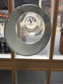
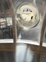
The second gallery of the day was the contemporary gallery the Ikon. Here the collections shown are powerful and graphic showing a real persons opinion on the state of the world. The architecture in the entrance to the gallery with winding glass staircases, paired with floor to ceiling drapes of photographs and interesting 3D structures made from the windows of the gallery was the first insight of the abstract style of the gallery. Particularly interesting was a tube coming out of one of the windows it looked as though someone had pulled the window from the centre and into the room. The tube was hollow allowing you to have a tiny glimpse of outside of the gallery, creating a flow from the outside inwards.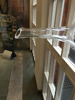


The main exhibition in the Ikon was by an artist by Fiona Banner called 'Scroll down and keep scrolling'. Here through a series of bold typography, projections and pre-recorded films portrays Banner's strongly opinionated perspective of the world.Upon entering the first floor of the exhibition you are greeted by a wall full of bold headings which look similar to the font used on most well known newspapers for their headlines. the piece has no distinct colour but every few seconds seems to change with the lighting of the room. This creates quite a personal effect as your experience of the colours at the beginning of the collection would be completely different from the person a few seconds prior and a few seconds later.


 On the other side of the room you are met by a 1000 page book named ' The Nam' comprised of three films about the Vietnam war described in their eniterty by Banner. A friend of Banner's who was a writer read the book and described it as 'unreadable' In Banner's sarcastic nature she printed this in the beginning of the book. A poster of her holding many copies of the book is placed next to the piece, and in the same nature as the wall opposite has no true colour but changes every few seconds with the rest of the room.
Following this section of the collection is probably the most attractive piece in the exhibition. A enormous neon light display showing the phrase
'THE BASTARD WORD' Due to the dark nature of the exhibition as there is very little lighting within the rooms this is extremely eye catching and many people seem to stop in their tracks when seeing this piece. As with a lot of the images within this exhibition it is rather explicit. The neon is handmade by banner and depicts the title of one of her previous exhibitions, where she explores the difficulty in her relationship with language and the power that language hold, similarly how we are all trying to fix something with words that cannot be fixed. Banner describes language and words as 'The blood of our thoughts' This i feel accurately describes the difficulty people face with anxiety and trying to describe things when words seem to fail us. the connotation of blood is one of pain and fear which symbolises the difficulty and fear that words can give to people.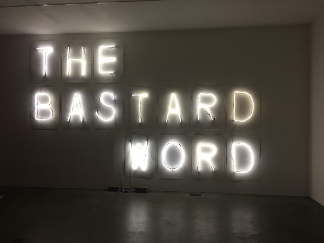


 Adjacent to this is a piece title 'Arsewoman in wonderland' which is the written description a porn film with the same title. From a distance this piece looks rather innocent and many people were taking pictures of the art without realising the true nature of the words in front of us. Upon reflection it could be understood the true meaning of the words. The pieces true identity is disclosed due to the fact the whole thing is installed upside down. This piece was aid by Banner to have been awkward and uncomfortable to produce and this was extenuated by installing the work upside down. The room that contains both the 'THE BASTARD WORD' and 'Arsewoman in wonderland' is solely lit by the neon of the bastard word, creating a rather awkward nature to the room due to the synthetic light which alters the feeling of the room as there is nothing organic, a feeling of misplacement is fabricated. This teamed with a large capitalised phrases, an entire piece upside down and the cold nature of pure concrete walls and floors makes the room reflection the uncomfortable style of the pieces.
The next few rooms contained smaller pieces of Banners work. Ranging from chairs printed with the image of someone's bottom and some engraved with words all over, to an old tv showing a model reading a description of herself. The description was written by Banner as she drew a nude Samatha Morton. Morton had not read the text written by Banner and the next day performed the piece to an audience, in effect describing her undressing and lying naked with words. The piece is extremely explicit yet rather poetic creating a juxtaposition between the lyrical nature of the words and yet the graphic way she describes a naked body.


 Continuing to the floor above this was another exhibition by Banner where you are immediately greeted by a huge plastic structure of scaffolding, The idea behind this is that when exhibitions are developed the artwork is often held together or built around scaffolding, however this is normally removed. In Banners against the grain personality she has took this to become a sculpture in its self. Moving into the next room there are once again similarly to the floor below many magazines written by banner are displayed on plinths. An unusual way of portraying text is also explored by having a t-shirt pulled over a plinth so the writing on the back of the shirt becomes a piece of art. The shirt describing the existence of a character in a story only existing in the mind of the person reading. The transition wall between the giant scaffold structure and the t-shirt display is itself becoming part of the exhibition as from the floor to the ceiling is covered in individual pieces of art work. The use of creating vast pieces of work that reach the whole vertical height of the room creates continuity throughout the exhibition and allows more depth into each piece as the viewer is forced to look up and around rather than what is at eye level with them, cleverly this forces people to find more within an exhibition which before they may have just walked straight by.


Directly opposite this is the use of vertical space is seen to be fully used as an advantage by the use of a extremely tall tower of book. This is what I originally thought was one of the the only pieces within the next room, as to my knowledge for a start was that was the only sculpture simply surrounded by bean bags. However in true Banner style the bean bags themselves are part of the exhibition.each of the bean bags depicts a full stop from different fonts including Banner's own font. These bean bags are full stops blown up to human size proportions, so in affect you become part of the exhibition when sitting on them, they provide a place to sit and pause for thought, like a full stop creates a pause in a sentence.
Walking through the Ikon gallery a sense of space and openness is fabricated due the use of glass as part of the architecture. All walls covered in windows create a flows of light through the building and make the small gallery appear far larger due to the ability to see beyond the walls and to the outside. The vast use of glass also works as a platform for artist credit and an insight to what the gallery has to offer.


The second image describes the most interactive piece in the gallery cleverly described as a lift. As you travel through the floors of the building the lift travels through an octave going from high to low and back again. This breaks up the sometimes awkward travel of a lift being enclosed in a small area with people you probably don't know, into a happy and hilarious experience. When travelling through the floors of the building you find yourself in paces when you can see through the entire building, creating a feeling a space in an otherwise narrow and tight room.


Like with the other galleries visited I drew observational sketched throughout my experience.Here I tried to capture some of the typography within the collection and some life studies from people visiting the gallery. Such as the person sat on one of the bean bag sculptures.


At the end of the trip I visited the shop and brought two postcards showing a glimpse into the nature of Banners work from the industrial image to the typography. I also collected some booklets throughout my journey which helped me to understand some of the pieces within the gallery.


