Paper cutting workshop
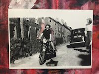
The workshop began looking at images from artists that specialised in the intricate art of paper cutting. Paper cutting could be as simple as removing an area of the image, creating a window through the photograph to allow for backgrounds to be placed underneath in a collage fashion. Other forms of paper cutting take on a more three dimensional form, small sections of the photograph are strategically cut out and folded upwards in order to create a scene with the image. I chose to mainly focus on removing sections of the image to create a gap within the picture. As with many of the other workshops images were selected in order to link with the theme that we have been exploring. I chose an image that I had used in many other workshops, in which two members of my family are pictured on a motorcycle in front of an old street of terrace houses. I chose the image as there are many sections that could be removed to re-contextualise the scene. To note that the images used in this workshop were printed onto A4 cartridge paper unless stated.

I began by removing the woman within the photo, this left the idea of the man behind her holding what was now a blank space safe on the bike. By leaving this space open it gave me chance to re-contextualise the image by laying it over different surfaces.
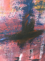
As we had just finished the exhibition, in which I created an extremely abstract painting with many vibrant colours, I used the pieces to my advantage to create a back ground for this collage. ( the full range of photos taken are shown in this post ). The most successful of these images were ones that contained colours that are associated with particular emotions or situations.


For example both the red and black create a rather sinister tone. The absence of a figure replaced with mainly black could indicate loss or mourning as the person is replaced with darkness. Whereas the the mainly red tones connote a more ambiguous loss, due to the colour red being associated with anger and violence.
 |
 |
 I next chose to remove the man within the image to juxtapose the other paper cutting. This however turned out very differently, with the previous paper cutting it was one large space as a whole section was taken away Due to the position that the man within the photo was sat, it meant that sections of him had to be removed at a time.
As the colour of the background would be spread through the centre of the image it created a much more subtle use of this technique, meaning that if more muted colours were used it wasn't as successful.


I wasn't as pleased with the outcome of this paper cut and decided that it was more successful the more of the photo that was removed. As the image leant itself to a urban scene it meant there were a lot of windows present within the picture.I decided to remove the main windows in the building in the background and to remove the windows of the car to the right of the image. In order to create the idea that the windows showed a trace of the situation happening external to the scene.
 |
| Initial removal of the windows. |


When presenting these paper cuttings inside my sketch book I wanted the true purpose of the image to be maintained. I completed small sections of coloured backgrounds for the images and presented them layered on top of these.