A trip to New walk museum in Leicester.
 During this week I visited New walk museum in Leicester after a friend suggested I take a look at the collection of German expressionist pieces this museum is known for. The history behind the exhibition is a complicated and unique one. The museum has the largest collection of German expressionist pieces outside of Germany, how they arrived here was particularly interesting. When the paintings first came to England they weren't, as such, meant to be here and were brought in on the down low. Like in many cases within the art community, exhibitions and individual pieces can be seen as quite controversial, these pieces often make for the most interesting.
Before even entering the museum you are greeted with art literally at your feet. Within the pavement outside of the gallery there are butterflies and other insects encased in glass between the slabs. Giving an insight of what the inside of the museum has to offer, as within the museum there is a large collection of fossils, bones and preserved creatures.


 Before entering The expressionist exhibition, there was a collection of artefacts from all over the globe. It was at this point I took minute sketches of some of the objects in the cabinets. As they were reasonably quick drawings they only give the general impression of what was in front of me, however looking juvenile and messy. I also took some pictures of some of the pieces within the room. However it was also at this point I was rather strongly warned about taking photos within this section of the museum, especially the pieces of Picasso ceramics.
Before travelling to the museum I looked on the website gallery at pieces that I was interested in and some of the artists featured in the collection. The artist Franz Marc stood out to me with his use of vibrant colours and unusual form within his pieces, and this I was rather fond of. As I couldn't take photos within this exhibition I collected two of the booklets on offer about the pictures I liked within the selection. One on Marc's Red women, which within Marc's work is a rare piece showing a figure rather that his usual subject of animals. The hair of the figure within almost blends into the subtle foliage of the background, Marc was a strong believer that art was significant, and everything within a picture had particular meaning. He also wanted to explore humanity and their harmony with nature, using both colour and form. The blue and greens of the image that blend with the woman are spiritual colours, maybe trying to illustrate a biblical image, both portraying a naked women and a 'green' connection to nature

The second booklet I collected was on Ernst Neuschul's iconic piece of Messias (1919) oil on card.This image is displayed on the entrance to the museum and takes pride of place in the expressionist ensemble. The piece is controversial like much of Neuschul's work as he tried to portray the inequalities within society and had a history of difficult situations within the artistic community. In 1939 in an exhibition in Czechoslovakia his paintings were slashed and defaced with swastikas.This piece is a very early self portrait, and with the title of messias which is the Arabic word for messiah,it showed Neuschul's belief in himself and his artwork. He makes himself the true focal point of his own image, reiterating this to the audience by having his own figure in the image point to his chest. This powerful gesture, paired with the strong facial expressions made prominent by the sparse background, truly convey Neuschul's ideologies and personality.
In this section of the exhibition a projected image was shown on every wall, of many of the pieces and their history, many of these were in black and white and not detailed images but simple line drawings that were prominent within the collection. A serene type of music was paired with this. The use of a visual 3D display paired with the element of sound to portray a particular theme, gave the exhibition a hands on feel as you walked through the experience, while looking at all the pieces surrounding the walls.
 While walking around this section of the gallery and the other smaller exhibitions showing older more realist paintings of beautiful landscapes and the very abstract expressionist pieces, I took notes on the paintings I enjoyed. Within these notes i took down the artist, the size of the piece ( if available), the mediums used, the title and when the piece was either printed or produced. By doing this I have created a glossary of paintings, artists and techniques for future reference to use in my artist research and inspiration for future pieces of my own.
' At the fortune tellers
Paul Kleinschmidt 1883-1949
Etching and dry point
Printed in 1922 '
http://germanexpressionismleicester.org/leicesters-collection/artists-and-artworks/paul-kleinschmidt/at-the-fortune-tellers/
http://germanexpressionismleicester.org/leicesters-collection/artists-and-artworks/paul-kleinschmidt/at-the-fortune-tellers/
'Blind Man
Otto Dix 1891-1966
Lithograph
Printed in 1923 '
' Stormtroopers advancing under gas
Otto Dix
Etching and aquatint
Printed in 1924 '
'The March into the unknown
Max Slevogt
P1.1 From visiovo 1916-17
'The Yellowstone Falls
Edmund Marriner Gill
Oil on canvas'
https://en.wikipedia.org/wiki/Edmund_Marriner_Gill#/media/File:Edmund_Marriner_Gill01.jpg
https://en.wikipedia.org/wiki/Edmund_Marriner_Gill#/media/File:Edmund_Marriner_Gill01.jpg
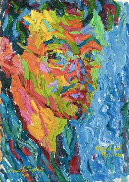
'Portrait of a Man
Karl Schmidt-Rootluff
Woodcut'
http://www.artyfactory.com/art_appreciation/visual-elements/images/texture/karl-schmidt-rottluff.jpg Closest I could find
http://www.artyfactory.com/art_appreciation/visual-elements/images/texture/karl-schmidt-rottluff.jpg Closest I could find
The next image is mainly of a quote shown in a description of the artist Winifred Nicholson.

'Winifred Nicholson
Crystals
Oil on canvas'
http://ichef.bbci.co.uk/arts/yourpaintings/images/paintings/thumbs/lams/290x216/llr_lams_l_f780_1977_0_0_290x216.jpg
http://ichef.bbci.co.uk/arts/yourpaintings/images/paintings/thumbs/lams/290x216/llr_lams_l_f780_1977_0_0_290x216.jpg
"The nature of abstract colour is utter purity - but colours wish to fly, to merge, to change each other by their juxtapositions, to radiate, to shine, to withdraw deep within themselves."
'Frank Howling
Lguanagone
Acrylic on canvas'
 After looking around the exhibitions involving 2D images I ventured into the part of the museum with models of dinosaurs and old fossils. At this point I stood in front of one of the largest dinosaurs structures and drew some of the details I could see at the joining of joints and different bones within the statue. These drawings are once again quick sketches, and the next museum that I go to I plan on spending more time on each sketch and making them slightly larger to allow for a more expressive nature of drawing. I also included a small section of Hieroglyphics, I could only capture a small section of the total piece as it was closed off for a lesson.
  At the end of my time in the museum I collected a small selection of postcards with the two pieces that I previously looked at and other pieces of artwork on. I plan to visit more museums and carry out a similar style of working for each one,building a small portfolio of each one in a collective sketch book to document visits. I also picked up at the museum shop a book on one of my favourite artists, this was a personal purchase. However her work is based around many circumstances that the main exhibition showed. Kathe Kollwitz' work is based around the Weimar Republic and the devastation that brought to Germany. an issue that is show as a trace is many of the expressionists work in the collection at New Walk. There were many graphic images showing nature of warfare and conflict which are all the artists memories and personal experiences of early 19 hundreds Germany.
Links to images found in New Walk museum.


