Three pieces for the exhibition.
 The brief given to us over the past two weeks informed us to create three differently sized pieces, each one three times larger in succession. I used the piece that I created for 'working on a larger scale' as the first of three pieces and then worked upwards. I decided the next image I should work on should be the largest of the three pieces. I first sourced a board which was 49.5"x37". After looking at the texture of the board, I decided not to prime it with a layer of emulsion but to work with the roughness of the board instead. As with all of my previous experiments, I was mainly interested in the texture of the dry coarse board and its enhancement of the texture of the paint.
I began to work on the board with white emulsion in an expressive motion. After the paint was layered onto the board, I used a coarse sandpaper to remove some of the paint and to pull the chipboard apart to create rougher areas. However, after I had made some marks I considered that these may be too sporadic. I had previously completed some observational sketches based on a photo of my family, looking at the main shapes within the piece to create expressive marks.
Before adding colour to my board, I worked in my sketchbook, testing marks and making a pallet of colours that I wanted to use on my board. Working on from the smaller piece, I decided to follow on with the warm colour harmonies, however with this piece, looking more at pink hues and purples hues to follow on from the red in the smaller image. I worked mainly with a dry brush to create rough marks, similar to the work by Peter Bruning.


 |
| the initial layer of colour over the expressive marks. |
 |
| thinning acrylic. |
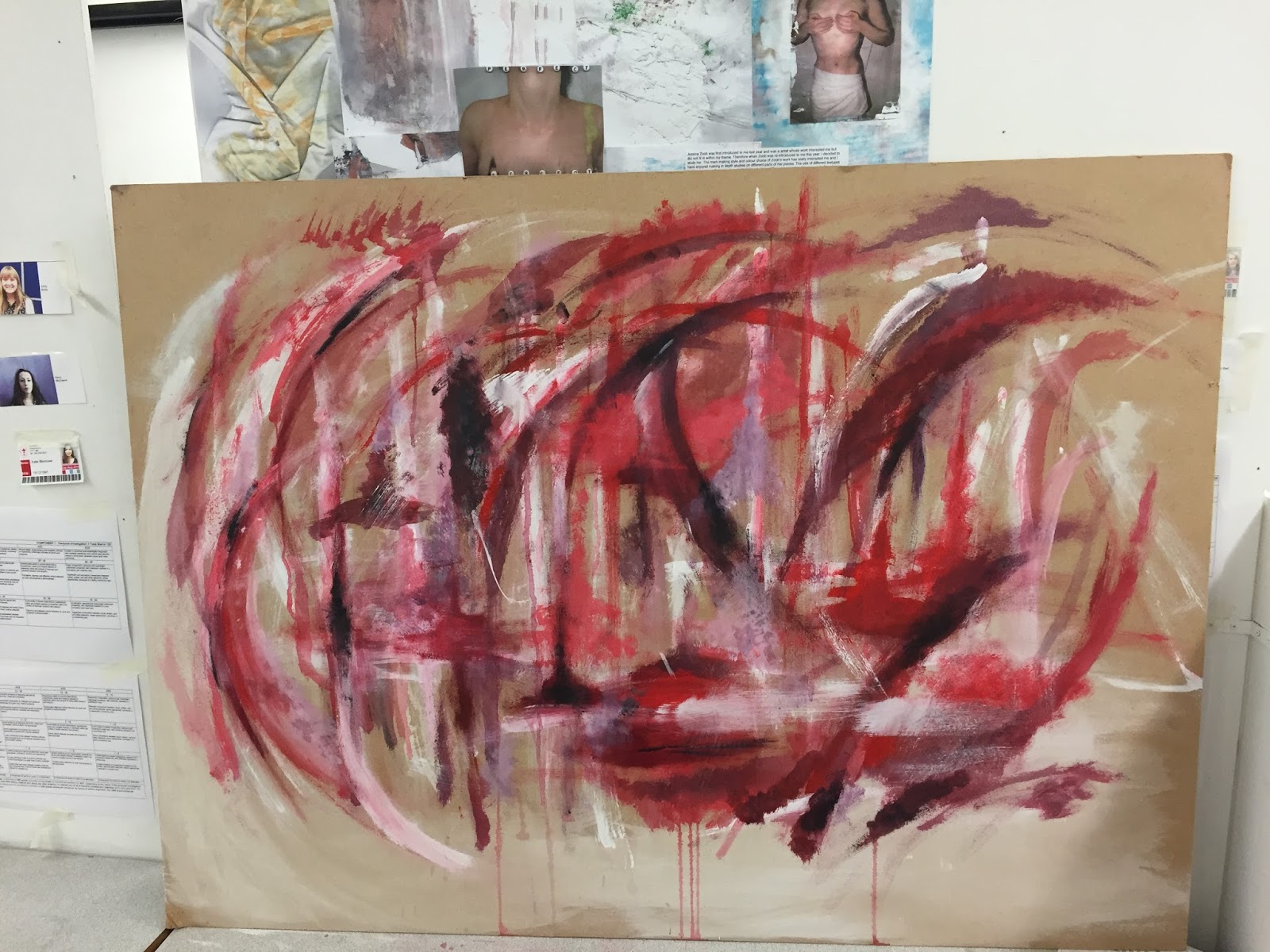
 I particularly liked the marks made when influenced by the bottom of the woman's dresses in the photo. I decided to paint these marks onto the board. I didn't get a picture at this initial stage of working, but began to add colour around the lines made. It was at this point that I decided that the white lines were too bold on the background and the colour was lost over them. I then decided I would lay colour onto the board and bring the lines back through at a later time. I continued to layer paint on top of the board, mainly focusing the colour towards the centre. When working onto the board, I did find that, due to the chip board and porous fibres, the paint did struggle to layer onto the board, and I had to find a way to make the paint thinner in order to achieve the expressive marks that I used in my smaller images. I attempted to replicate the texture of the board in my small sketchbook by laying newspaper onto the page with pva, ripping the paper off and painting over it with emulsion to create a dry, rough surface. I found that using a really wet brush and mixing the acrylic with water made the paint flow onto the surface more fluidly, creating a smoother stroke.
 |
| After the first few hours of adding paint to the board, still mainly focused at the centre with black corners. |
 |
| paint fading due to water evaporating |
After laying a fair amount of paint to the board I decided to experiment with dripping paint down the board, to drag colour through the piece. Although I did find that due to how absorbent the board was, the paint thinned down with water did fade in colour as the water dried off.
I left the paint on the board to dry over might before I added the observational paint over the top again, as to make the white crisp and to not drag paint through this. I attempted to follow the trace of the original painting as close as possible so that the whit undertones matched up. After applying the white sketches over the base paint the shapes were still really bold and took over the marks I had made on the board. As I had previously left the corners of the board paint free I wasn't sure if the bold lines were exaggerated due to this and if more marks would tone down the sketch.
 |
| White observational drawing layered over the base layers of paint. |
 |
| Expanding the paint to the corners of the board which toned down the white of the observational sketch. |
 After talking to my peers I decided that the white lines took away from the marks that I had made, and decided to paint over these lines to take away from the boldness of the pattern. by doing this it meant I could have a trace of the original piece linking in to the theme we were given at the beginning of the year. Before I started to cover the lines I wanted to find away to overcome the dryness of the board further so I could back into the board with cardboard similar to how I completed my first image. I experimented with layering pva onto a page of my sketchbook and painting over sections that had a glue base and sections that didn't to compare how the surface was changed. When layering paint over a layer of pva even with a dry brush the paint glided onto the page smoother which meant that I could use cardboard to paint with over the paint already on the surface of the board. I then painted a layer of pva onto the board and left it to dry over night, the pva not only made the board reasonably smoother to paint on but also took away the matte look of the paint in some areas. I then continued to paint over the lines in my piece and filled gaps in the edges and small inner sections of the piece, still experimenting with marks and tones in my smaller sketchbook.
  |
| This was the piece prior to the refinements made with the week with foundations |
 |
| The way that the light fell on my piece gave me an opportunity to take some up close shots of the texture. |
 |

 It was at this point I then decided to work into my next piece in this three piece. I initially wanted to work smaller scale than my first piece but after talking to others in my group I decided to a piece in the middle of the two incorporating both of the two ideas. I began with laying marks similar to the first piece using cardboard and more red tones than in largest piece. I began with an A1 sheet of cartridge paper and similarly to the first fierce I left some of the paper blank on the edges a smaller border than on the first piece. The marks on this piece were slightly more chaotic than the other two pieces. I left small areas on the page blank for acrylic transfers. I photocopied my original piece and decided to use the acrylic transfer technique to paste traces of my first image onto this piece. This not only added a link to the overall theme of our project but helped to link to the texture I had been exploring previously.
It was at this point that we started to work with foundation and they began to give us ways of refining our work to make them all work together better. In my largest piece it was said that the other two pieces had far more darker areas and brighter contrasting colours. I then worked back into the largest piece with cardboard, black and yellow acrylic. This made it look more suited to be in the three piece. I added the black acrylic in the same style as the marks in my first piece, long stokes dragged out horizontally to create almost tree like structures.

My next point of refinement was to add thicker areas of paint as my work was rather 2D texture wise, I had been mainly exploring how dry paint was looking on the surface with thin layers of paint. It was suggested by a member of foundation to use my finger to collect paint and smear the paint onto the board leaving the thicker edges left by this action. I took this technique to all of my pieces.
 |

|
I decided to take some up close shots of some of the pieces to show how the different ways of applying paint were effective next to each other. The contrast between thick smooth paint and thinner layers applied with a dry brush.


After mounting these pieces on the wall I decided that are a three piece they needed more elements to link them together. I was particularly happy with the texture created by adding acrylic transfer on the middle piece and decided to add these to the largest piece once again using a photocopy of the smallest piece. Finding gaps in the paint I layered white acrylic down and placing sections of the photocopy on top.


 |
 |
| After the initial image was placed onto the white acrylic. |
 |
| Same transfer as the previous picture after the paper had been removed with a damp sponge. |


The last thing I had to decide on was how it would be presented on the wall. I actually worked into them with the transfers after they were mounted.I initially wanted to mount them from smallest to largest vertically, in a column type layout. However as many people were sharing spaces I had to improvise with the layout to also allow others to present their work. I went for the smallest piece being at the top and the largest at the bottom. However the pieces were staggered gradually down the wall. I think that this layout was still successful as a exhibition piece I am happy with how the pieces turned out.
However after reflecting on the whole experience in general I preferred working on a slightly smaller scale. I feel that the size of my first piece was far more successful than the larger two pieces. The marks were relative to the form of the piece, When working larger this is something I thought that i had taken into account. However when lining up the pieces side by side it was evident that the marks I had made were far to small for the sizes of the pieces. The smaller and finer details were lost in the vast mass of colour and I think this took away from the overall feel of the piece. If I was to work in the scale again I would definitely consider the scale as a higher priority rather than the approach that the bigger piece would be better. I would probably also consider which tools I used more thoroughly. Despite this I still enjoyed the experience and working in a different way with the pressure of a deadline and brief.
 |
No comments:
Post a Comment