Sunday, 31 January 2016

Nel Ten Wolde

 Nel Ten Wolde

The work by Nel Ten Wolde combines the beauty of nature from images taken by her on her travels around Albacete, with the surreal affect that collages can fabricate. By using  mixed media alongside her collages a spiritual and distanced mood is created for the viewer, it invites us as the audience to be taken into the arid landscape and spiritual state of mind ten Wolde finds her self in. The fragmented style of ripped photographs is teamed with the juxtaposition created by the fluid shapes her collages take on show both the harsh landscapes and history of the place she finds her self and her true love for the underlying forms of nature. 

Rastrojo (2012) Collage & mixed media on paper:
Rastrojo (2012) Collage & mixed media on paper


The cool tones of charcoal greys and the straw like folliage of this piece create an isolated feel to the image.
The lack of colour and pattern within the collage makes the piece seem dry and desolate mirroring the landscapes of rural Spain. Ten Wolde has chosen to only extenuate small aspects of the photographs, making the mix media aspects of this collage rather subtle. The lines continued from the mainly grey photographs leads the eye through the piece to the edges of the paper vertically. This is in contrast the the focal point of the image where a twig cuts horizontally across the page. This contrast in form adds to the sinister mood illustrated by the lack of colour and pattern.  

Hidden Layers IV (2013) Oil on canvas:
Hidden Layers IV (2013) Oil on canvas


Unlike Rastrorio this piece by Ten Wolde is Oil paint on canvas. It depicts a more urban image with a electric pylon being at the direct centre of the image mimicking nets which is a common theme within this series of paintings. The fragmented style is carried on in this piece however the separation of images is much more fluid. In this painting there are far more curved lines and lyrical motion which contrast with her normal images which depict harsh shapes and line. Once again in this piece the pallet is extremely neutral with muted blues painting the sky. This creates an image of stormy conditions giving the piece an eerie feel. At the base of the composition there is links to her time spent in the desert with the contrasting images of the sky and netting with the arid brown landscape she spent most of her time photographing.

Silk Nispores II (2014) Collage & mixed media on paper
In the piece Silk Nispores II the idea of silk netting is once again paired with foliage however this time in a monochromatic style. The foliage shown here is busy and dense which isnt something traditionally shown within Ten Wolde's pieces. The shape of the bushes is continued in mixed media extending the image vertically and cementing a strong base to the image. The netting images here creates the aspect of fragmentation, which in turn depicts the shape of sails on a boat which is something I personally see within this piece. 

Thursday, 14 January 2016

A week in Photography

A week in photography.

During the two lessons spent in photography I learnt about many different aspects that went into creating a good photo. Learning about the importance of composition and lighting, looking at both high key and low key. 
Manually focusing on rowan in the classroom short range image.
At the beginning of the lesson looking at how different artists used compositional techniques in order to create a visually pleasing image, inspired me when looking around the college and taking photos. At first we had to learn how to focus a camera using both manual and auto settings. Experimenting in the classroom showed me how to use the camera properly. In order to manually focus a camera you must turn the front of the lenses and focus on whatever object you want to be the focal point of the image. There is a benefit to this, that with auto focus it focuses on what the camera believe to be the main focal point with this technique you can tailor the photo to your choice. However with manual focus you're focusing to your own eye sight and to other people the image may look out of focus or blurred.  With auto focus it provides a quicker way of taking an in focus image, by holding the shutter button half way down it focuses the image and keeps is focused until the photograph has been taken. The only issues with this is that up close photographs do not focus well on a small image in front of you and focuses on the background which may not be the desired outcome. 
focused on background rather than foreground.
focused on background rather than foreground
It was at this point Jeskirt asked us to go round the college and take some pictures of our own based around three of the themes that made a good composition. This could be one of:
- Rule of thirds           - vantage points
- visual cropping        - perspective
- framing                    - leading/ converging lines
- action                      - negative space

The Gnome is intersecting with the right hand third of the image making him the focal point of the image. With the background not in focus but the Gnome being in focus also adds to the attention being on him. I enhanced the blacks in the image to make the background darker, and brightened the Gnome to draw more attention in.
An example of the rule of thirds using an art students project.
I chose to look firstly at the rule of thirds, after briefly looking into this in a previous art lesson and then again in the photography I decided this was a compositional element I wanted to explore. This technique requires the photographer to imagine or use a grid over the image they are taking, for a aesthetically pleasing image the focal point should land on an intersection point of the grid lines in the thirds of the image. I found that after taking all of the images on the day that two of the photos I used turned out to be ones using the technique of rule of thirds, I then decided to edit these photos in Photoshop using the levels tools to enhance and change the contrast on the photos. 
This photo also uses the rule of thirds with the boot entering on the right third of the image. I enhanced the contrast on the photo and the saturation to make the reds darker and the reflection more noticeable as I wanted the boot to be the main focal point of the image. I also chose a rather plain background to offset the colour of the shoe.  
 The second technique I explored was the idea of converging lines this is a technique that explores the idea of fabricating depth and an idea of geometry within your photography. Within the entrance to college there is an vast amount of opportunity to create the technique due to many poles and beams being used within the architecture. In the image to the left I exploited the use of harsh angles created by the poles of the ramp and the geometric pattern of the tiles in the wall and lined the two up. Where the too lines meet creates a convergence which creates a focal point and leads the viewers eye to the centre of the image. I edited this photo in Photoshop to make the white of the pole more vibrant in order for it too stand out in an otherwise dark image. I also experimented with the clone and stamp tool to edit out a section of hair in the top left corner of the image. 
In the image on the right I experimented more with focusing on nearer objects and making the background of the image out of focus. In this particular photograph it caused the effect of converging lines as the audience of the piece follows the lines of the railing back into the photograph creating the illusion of depth. In the background of the image it also converges with the horizontal beans and the curved ceiling of the walkway creating a vantage point in the far back of the photograph. 
 

.
The last of the techniques I explored was the idea of both moving in close and framing. Looking at what was available to me around the college and the door heading towards the gym had a window in a circle shape, this allowed me to frame Rowan in the image to ensure that she was the focal point of the image. I also moved in close when taking the images which cropped some of the circle off by doing this it creates the idea of moving in close and zooming into Rowans face. When taking this image I did encounter the problem of that flash on the camera did mean that there was a glare, as I was new to these cameras I wasn't aware on how to reduce this problem, however the glare can be edited out on Photoshop. The photo to the right I think was the least successful of the ones in this style as due to it being off centred it takes away from the idea of the photograph I also encountered a lot of glare which I found difficult to counter act in Photoshop.
In this photo I did manage to remove some of the glare on her face however after editing a large amount of it away the photo began to look choppy as the skin tones did not always match the natural tones.
 
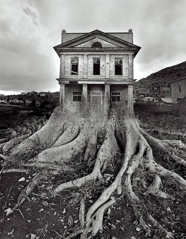
 On the second day of the photography we expanded our work on Photoshop by looking at the ways photographs could be layered and edited in order to re-contextualise them. This consisted off double exposure editing and selective layering. Also looking at the work of Jerry Uelsmann whose photography takes on a surreal feel as he warps images of natural forms with man made objects.  In this Photoshop session resulted in using different tools in the Photoshop tool bar, the first technique I explored was using the lasso select tool to select a section of the image to remove and to insert another one of the photos I took in its place. I chose to use the image of Rowan in the window as I thought by altering the background of the window it would appear as if the door was a gateway to another place. I first had to select the part of the image I wanted to remove.
I next had to select an image that I wanted to layer behind Rowans head. I chose an image taken of an A2 art students as it had quite a surreal feel and would make it appear that Rowan is somewhere else looking to the audience making them wonder where she's looking from. To insert the image you had to copy and paste the picture from another tab on Photoshop and then go to Edit > paste special > paste into. This would make the image paste into the section I had previously selected with the lasso tool.
 The next style of photo I decided to work in the style of was double exposure layering two photos and changing the opacity of the image to create the idea of a different background. I used the image I previously mentioned when talking about rule of thirds with the boot on a wet pavement paired with an image of a droplet of water on a bush in college as if the boot was walking in a forest. To do this I had to drag and drop the image of the bush onto the top of the image of the boot as a new layer.
 The next stage was to use the tool which makes a separate layer on the second image to make sure the editing is non destructive to the image below. Taking the paintbrush tool in black with the second section of the layer selected I removed the layer of the bush on top of the boot to make the boot prominent within the image. Doing this both the texture of the foliage and the original texture of the gravel can be seen making for a more successful image as it links with the themes of texture i had been exploring in my work within the studio.

The last technique I decided to explore was to create a reflection in a window of one of my images using the same process as before. I first needed to crop the image then layer this over the window image.


lighting definitions

High key lighting
adjective
1: (of a photograph) having cheifly light tones, usually with little tonal contrast. 

Low key lighting 
adjective
1: (of a photograph) having cheifly dark tones, usually with high contrast.    

Saturday, 2 January 2016

Working on a larger scale.

Acrylic experiments on a larger scale working with inspiration of Peter Brüning. 


After experimenting in my small sketchbook with the ways in which acrylic can be applied to the page to create an abstract style which was inspired by sections of Brüning's 'Onhe titel'. I applied the acrylic to the page with ripped pieces of cardboard, by doing this it allowed the paint to drag across the page in a rectangular manner. The rough texture of the cardboard removed some of the paint underneath and blended it with the colours being added to the surface, it also allowed for washes of colour to be added over the top of the work. As the cardboard became saturated with paint, colours began to merge and create new hues, this meant after a certain period of time using the same piece of cardboard you have to use a new section. This in effect means to create a larger scale image a lot of cardboard is used through the process, to create a similar effect a pallet knife could be used, as the edges of the knife mimic the nature of the cardboard. I completed a few of these smaller scale images, with the red image seen above turning out to be the most successful due to the high contrast between the darker brown shades and the vibrant red. 


The first stage of the stretch, size A1.
 
It was at this point I decided to complete an image on a larger scale. Firstly choosing to work A1 as this is the largest size available to me, this would also allow for a more expressive style of work. When making a stretch the paper must damped with a sponge and laid on the board. Working quickly damp gum tape must be added to each side of the paper applied with a lot of pressure to ensure a tight stretch. When the paper dries it should be tightly stretched onto the board making it easier to work onto paper that doesn't crease or move. I did find that when I was applying a layer of emulsion to the page as a base and to add texture the paper bubbled and when it dried there were slight creases, I put this down to a poor stretch as it was the first time id ever done this style of work. 


After letting the base of emulsion dry I started to work into the piece with acrylic and cardboard in the same style as in my smaller sketchbook. Working on a larger scale allowed the marks I made to be a lot more expressive as I had further to go on the page. Through working with different marks I learned different combinations of marks that I thought made  for a satisfying image. By dragging a thick amount of paint vertically across the image then taking the side of the cardboard across this made an almost tree like figure. Working with this as a main aspect of the piece I ended up developing a piece that had its main bulk at the centre of the page then these sharp spikes of colour extending the piece further from the middle. 


The final outcome of this image.
After completing the main two thirds of the image I decided that this image could relate to the theme of faded and traces with the transition of colours from mainly dark hues with a compact and dense composition. At the other end of the image a brighter and less dense area of paint. In this way the idea of a once strong memory fades into a less prominent memory which may get altered over time as you recount it, here shown with the changing of colours. When completing this image I feel I could have made this message stronger if I had added complementary colours which if I completed this style of image again I would add complementary colours to make a more vibrant image. I particularly like how this image mimics an explosion however I did feel that when the gum tape was removed from the board, the blank space left where the tape was made the piece look awkwardly placed on the page. To counter act this I took a scalpel and trimmed the edges of the page as close as I could to the areas of colour, this made the composition of the piece slightly better as the image seemed to fill the area of the paper. 


As the theme I was exploring before i looked at abstract expressionism was texture applying a base of emulsion to my stretch made for a vast amount of texture on the papers surface. By using cardboard rather than a brush to apply to paint it made areas of built up paint creating almost ripples in the paint. By taking a clay tool to areas of the paint when it had dried it allowed me to remove some of the paint creating a rough texture which contrasted with the smooth ripples created by thick acrylic. I was initially going to work back into this piece with glue and acetate like what i had been experimenting with previously in my sketchbook however I was happy with the way this piece looked without the addition of more texture. However I plan to complete another larger scale piece and work back into it with different mediums. 


Over the holidays I didn't have to ability to complete larger pieces on board and so i could only paint smaller paintings on A3 sketchbook paper. It was then I understood how much having the paper stretched to board helped. Painting onto paper that wasn't attached to anything made it difficult to get the same type of fluid motion without the paper ripping, using different paper also meant that my paper was saturated and became hard to work on. However I did explore the use of colour more in these pieces, using complementary colours such as purple and green, this made the image slightly more vibrant. The acrylic paints I used weren't as high quality as the ones I used at college which also took away from the colours used in the image. I do not think that this image was as successful as the previous image, however I do think the use of complementary colours aided the overall image even if outcome wasn't as successful. 
 
I plan to complete more larger scale images and plan to mix media to add to the overall texture of the images. I also want to make the images more personal to me as these two pieces weren't based on any particular emotion or memory and I feel that if I focused on a specific event it might aid the overall effect of the piece. 

Tuesday, 8 December 2015

Experiments with acrylic on acetate.

Experiments with acrylic on acetate.


Ohne Titel, Peter Brüning, 1959 oil on canvas
While working in the style of Peter Brüning and taking inspiration from his pieces such as Ohne titel I have looked at how expressive marks can be made on acetate with acrylic paints. I completed an observation drawing of the piece shown ontop of the piece nr 100 printed on acetate.

 I had previously explored the way acrylic looked on acetate and the use of a dry brush created brush strokes similar to which seen in Brünings work. After completing an observation piece of a small section of Brünings work on acetate I decided that I wasn't sure which way the piece looked best. Wether the acrylic on the surface where brush strokes could be seen, or place acrylic down to the page so only the colour showed through and the original colours of nr 100 could be seen. It was at this point I decided to look at the acetate through a light box and see the effect the light shone on the piece would have.

Acrylic facing up
Acrylic facing down
With the acrylic painting facing upwards the strokes of the brush can be see, when working on top of acetate the brush used must be completely dry as water will simply run straight of the plastic surface. This makes the paint applied look dry and every hair in brush can be seen in the strokes of the paint. By having the acrylic facing upwards then small pieces of the Nr 100 (Brünings piece printed on the acetate below) are covered by the paint. When having the acrylic facing down towards the surface a completely different style of image is fabricated. Small sections of the acrylic can be seen as undertones through the acetate due to the transparent nature of the medium. It also means the entirety of Nr 100 can be seen. Due to the piece having green tones through ( a complementary colour to the red used in the observational painting) a very vibrant image is created. However by laying the acrylic down to the surface, the dry brush strokes which mimic the work of Brüning cannot be seen.

Acrylic facing down.
Acrylic facing up.


By using a light box the stokes of the acrylic can be seen either way that the paint is facing, which means that the main idea of the green of Nr 100 showing and the brush strokes that were hidden when this was the case can be seen.

By printing the images of the acetate on a light box onto acetate it allows me to show the brush strokes of the acrylic while also showing the colours of the Nr 100. 

Friday, 4 December 2015

Oil pastel transfer.

Oil Pastel transfer


The initial layer of oil pastel on cartridge paper.
To complete an oil pastel transfer an observation study must be completed. By looking at the object in front of you and analysing the main hues and slight tones seen and completing a base of these combined, creates the colours seen in the transfer. Firstly layering the tones that can be seen in the object creates the main section of the piece, this should be down in a brash manner as this isn't the sketch of object just the basic observations. Laying the side with the saturated oil pastel face down to the page an observational study of the object can be completed. Pressing firmly onto the back of the pastel a transfer of the drawing should be projected onto the page underneath. 


After completing this transfer I discovered I hadn't initially put enough pastel on the first layer of tones. To improve the strength of the transfer I layered a vast amount more pastel onto the page, once again using the technique of looking at tones in my object to create a collage of colour. This time the transferred image was a lot stronger in colour than my first attempt at this style of transfer. 


This technique creates a juvinelle image and this style of observation studies doesn't work with the abstract expressionism that I have been studying currently and therefore I don't think I will purpose transfers in this style. However the oil pastels themselves act as a transition to oil paints with similar characteristics to oil paints which is a common medium used in abstract expressionism. By using the oil pastels I get used to the medium of oils in a slightly more inexpensive and forgiving manner. 


Monday, 30 November 2015

Analysis and comparison.

Analysis and comparison of artists found within the theme of abstract expressionism.


Testament, oil on canvas
40x30x0.5 inches
During this week I discovered that the work I had been mainly interested in, from pinterest and books within college was characterised under abstract expressionism. Armed with this knowledge I chose three artists that fit with this style of work. The first artist I looked at was Simon Kenny, an abstract artist from Dublin whose work shows a combination of both the ideas materialism and spiritualism with his use of both colour and form. His pieces are designed to trigger emotion that may have been suppressed over many years by allowing the paintings to build and develop their own connections to the viewer as they are not based on any specific time or place. By taking this idea and applying to our theme it allows me to create an extremely expressive piece that may be based on a memory of my own but would allow people to make their own connection to my work, creating an idea of interaction and personal connection with my work. Another key characteristic of Kenny's work is the viewers opinion of the piece and the flexibility that comes with that. Some of his work may at times look harmonious and tranquil and invoke memories of happier past times if at the time of viewing the painting you found yourself in a peaceful mood. In contrast to this his work could also be seen as graphic and violent, due to the way in the which the paint collides and could invoke memories of painful experiences. Kenny's ability to depict an image that is so dependent on the audience of the piece fascinates me and is something I would like to portray through my own work. The image to the right is testament by Kenny I was particularly drawn to this piece due to large section of pale hues dominating the image from the left top corner and flowing through the piece, and the separation created by the harsh contrast on the darker tones at the base of the portrait. The form of the image is a portrait, the composition of the painting is balanced due to the heavier tones being mainly at the base of the image. The focal point of the image is fabricated by the illusion of crashing waves where sections of the two tones seem to merge together, at this point of the piece the main section of colour is seen with blue and red hues collide. As these two primary colours are complementary it causes the readers eye be drawn to this point of the painting. The use of oil paint and Kenny's use of a pallet knife to apply the thicker ripples of paint, this links to the work I've been creating in collage with the uses of texture, mainly created by the burning of acetate and cello tape transfers, as these create bubbles and folds within the plastics mirroring the thicker areas of oil paint.
  

James Brooks ‘Boon’, 1957
©  Estate of James Brooks/VAGA, New York and DACS, London 2015
Boon 1957, oil on canvas 180.3x173 cm.
The second artist I decided to look into was American artist James brooks his work being far more abstract than Kenny's with expressive and rhythmic brush strokes with contrasting patterns and very little form in the mark making unlike Kenny's almost scenic style. His work developing a brash and almost chaotic nature, mirroring the work of his friend Jackson Pollock, in the 1940's with the rise of abstract expressionism in a post world war II America. With a fairly dark yet juvenile nature to his pieces, fabricated by large areas of block colour his work takes on a rather expressive mood. The piece Boon was one that particularity stood out to me with the large amounts of contrast between the light yellow hues and black tones. Brooks described boon to be completely improvised and when listing the mediums used within the piece mentioned that there may have been traces of substances such of rabbit glue but he couldn't be sure, the experimental and unplanned nature of the way the painting was constructed is mimicked in the picture. A rather uneasy feeling s fabricated when looking at this piece, in my opinion the particular tone of yellow used within the piece looks rather out of places with the other wise clinical paler hues in the image. The vast amount of black that dominates the piece also fabricates the illusion of a sinister mood as the dark shadows of the piece paired with the brash nature of application cause a chaotic finish to the image. Similarly to the work by Kenny oil paint has been used on canvas, looking further into abstract expressionism this is something I have noticed is a common media. The bright colours created with this type of paint gives a different feel the way more liquidous paints would leave, the vibrancy of the colour and the viscous nature of the medium is shows through with every brush stroke. 

Peter Brüning - Ohne Titel
Ohne Titel 1959 oil on canvas.

On a very different scale to both Kenny and Brooks, the third artist I chose to look at was Peter Brüning whose work is on a smaller scale to the work of the others artists i have looked at. Brüning works on a smaller scale in order to allow for a more expressive nature to the way his paint touches the surface. As when working smaller even slight movements can change the whole dynamic of the entire composition. As an Artist Brüning belonged to the 'art informel' which was used to describe abstract pieces of work as more gestural pieces. The lack of a subject which is common to most abstract and expressionist work allows the audience to decide on what they believe is the true muse of the piece. Within a lot of Brünings work his pieces have a sharp and fragmented style, his use of gestural work makes the main composition of the piece to be created through the quick movement of his hands. A common characteristic of Brünings work is the idea that the painting is framed by the rest of the surface with the main bulk of the piece occupying only the central line of the surface. In the image Ohne Titel seen above the idea of line is illustrated through the use of a dark brown tone being pulled through the image, mimicking the idea of figures in a crowd. To me the piece could show a crowd scene as many of the expressive marks made by the paint create the idea of figures. A lot of the paint within the piece is muted by the addition of white oil paint this blurs the main gestural marks and in doing so gives motion to an otherwise stationary piece. A warm harmony or colours is used in this image with black, brown and orange hues which also adds to the idea of a crowd this mimicking the idea of peoples faces in a crowd. 


Verve
Verve Simon Kenny, oil on canvas 36x24 inches.
Both brooks and Brünings work takes on a far more expressive style than the work of Kenny. I like how that style of work allows for a more free flowing style of painting allowing for the true characteristics of the medium to be shown, this is something i would like to explore further. Within the studio I have already looked at the way emulsion can be used in such a way that expressive movements create a fluid type of appearance this could be something I could use in my experiments with working in this style. Kenny's work out of the three is much more controlled, and structured many on his images take on a surreal idea of landscapes. The way he uses the medium of oil paint to look like crashing waves or winds through forests, would mean that when I experiment in his style it would be a good idea to use a landscape image or multiple photographs to inspire the piece, this could link with the idea of memories as I plan to use photographs from my childhood or family to inspire pieces.
Ohne Titel oil, Peter Brüning.
Bound
Bound Simon Kenny. Mixed media 40x30 inches.
Both Kenny and Brüning use colour in similar ways using complementary colours to create a chaotic feel to the painting. Similarly using the main sections of colour in the centre of the image makes the viewers eye be drawn to the centre and from there is taken on a path through the image following the direction of colour through the piece. By looking at abstract expressionism I have realised that I haven't experimented much with colour within the studio and briefly touched on the idea with mainly oil pastels or chalk. To be able to complete a strong image in this style that is something I would have to explore more thoroughly. Using the ideas that I have looked at in the studio by looking mainly at undertones of objects and photograph and creating a piece with sections of these colours is something that relates to the work of these artists. As with their work there are bock sections of colours mainly complementary many of these could have been tones of the muse of the image.