Tuesday, 9 February 2016

Exhibtion pieces

Three pieces for the exhibition.

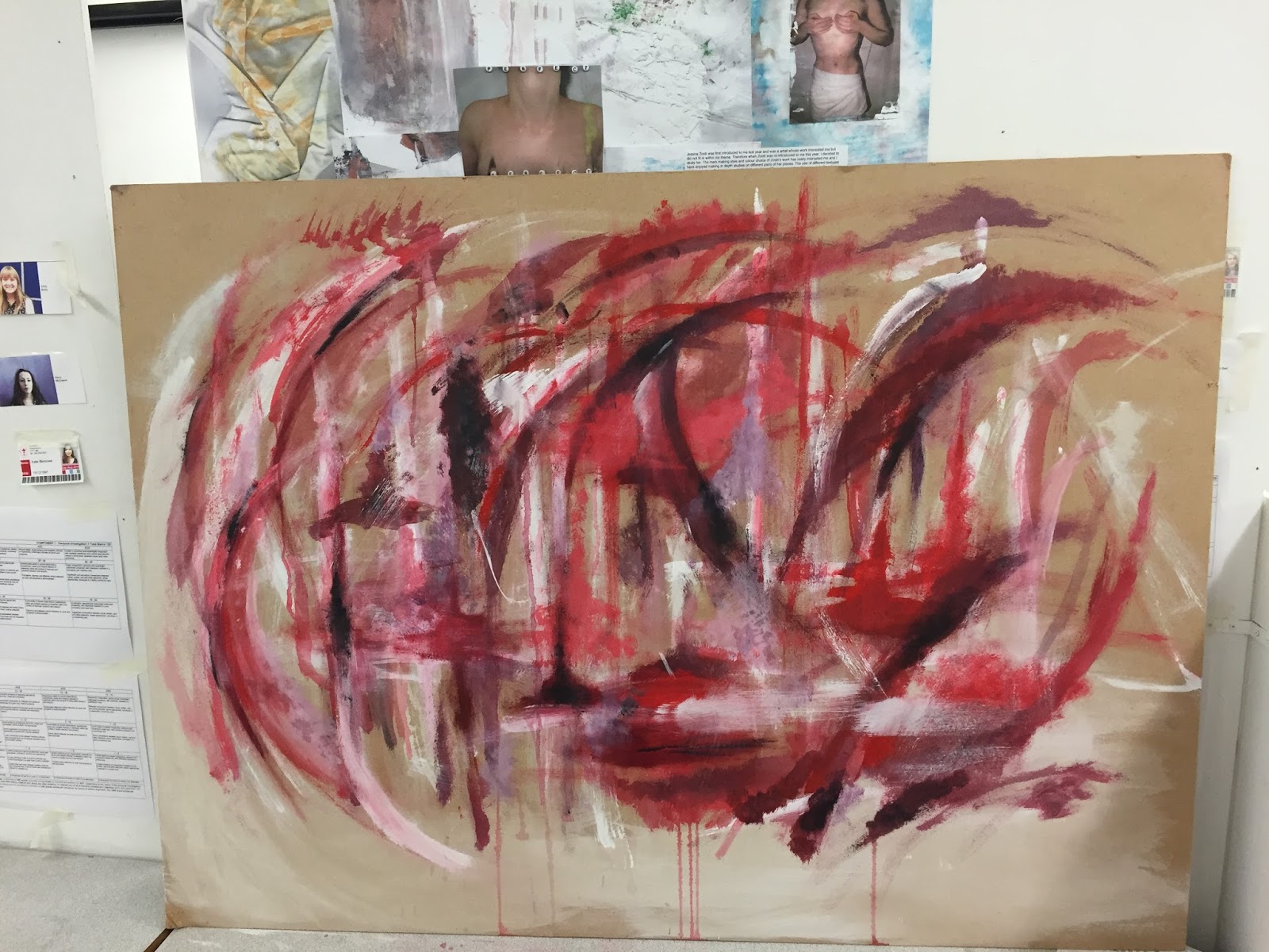
The brief given to us over the past two weeks informed us to create three differently sized pieces, each one three times larger in succession. I used the piece that I created for 'working on a larger scale' as the first of three pieces and then worked upwards. I decided the next image I should work on should be the largest of the three pieces. I first sourced a board which was 49.5"x37". After looking at the texture of the board, I decided not to prime it with a layer of emulsion but to work with the roughness of the board instead. As with all of my previous experiments, I was mainly interested in the texture of the dry coarse board and its enhancement of the texture of the paint. 
I began to work on the board with white emulsion in an expressive motion. After the paint was layered onto the board, I used a coarse sandpaper to remove some of the paint and to pull the chipboard apart to create rougher areas. However, after I had made some marks I considered that these may be too sporadic. I had previously completed some observational sketches based on a photo of my family, looking at the main shapes within the piece to create expressive marks.

Before adding colour to my board, I worked in my sketchbook, testing marks and making a pallet of colours that I wanted to use on my board. Working on from the smaller piece, I decided to follow on with the warm colour harmonies, however with this piece, looking more at pink hues and purples hues to follow on from the red in the smaller image. I worked mainly with a dry brush to create rough marks, similar to the work by Peter Bruning.
 

the initial layer of colour over the expressive marks.
thinning acrylic.
I particularly liked the marks made when influenced by the bottom of the woman's dresses in the photo. I decided to paint these marks onto the board. I didn't get a picture at this initial stage of working, but began to add colour around the lines made. It was at this point that I decided that the white lines were too bold on the background and the colour was lost over them. I then decided I would lay colour onto the board and bring the lines back through at a later time. I continued to layer paint on top of the board, mainly focusing the colour towards the centre. When working onto the board, I did find that, due to the chip board and porous fibres, the paint did struggle to layer onto the board, and I had to find a way to make the paint thinner in order to achieve the expressive marks that I used in my smaller images. I attempted to replicate the texture of the board in my small sketchbook by laying newspaper onto the page with pva, ripping the paper off and painting over it with emulsion to create a dry, rough surface. I found that using a really wet brush and mixing the acrylic with water made the paint flow onto the surface more fluidly, creating a smoother stroke.


After the first few hours of adding paint to the board, still mainly focused at the centre with black corners.
paint fading due to
water evaporating
After laying a fair amount of paint to the board I decided to experiment with dripping paint down the board, to drag colour through the piece. Although I did find that due to how absorbent the board was, the paint thinned down with water did fade in colour as the water dried off.
I left the paint on the board to dry over might before I added the observational paint over the top again, as to make the white crisp and to not drag paint through this. I attempted to follow the trace of the original painting as close as possible so that the whit undertones matched up. After applying the white sketches over the base paint the shapes were still really bold and took over the marks I had made on the board. As I had previously left the corners of the board paint free I wasn't sure if the bold lines were exaggerated due to this and if more marks would tone down the sketch.
White observational drawing layered over the base layers of paint.

Expanding the paint to the corners of the board which toned down the white of
the observational sketch.
After talking to my peers I decided that the white lines took away from the marks that I had made, and decided to paint over these lines to take away from the boldness of the pattern. by doing this it meant I could have a trace of the original piece linking in to the theme we were given at the beginning of the year. Before I started to cover the lines I wanted to find away to overcome the dryness of the board further so I could back into the board with cardboard similar to how I completed my first image. I experimented with layering pva onto a page of my sketchbook and painting over sections that had a glue base and sections that didn't to compare how the surface was changed. When layering paint over a layer of pva even with a dry brush the paint glided onto the page smoother which meant that I could use cardboard to paint with over the paint already on the surface of the board. I then painted a layer of pva onto the board and left it to dry over night, the pva not only made the board reasonably smoother to paint on but also took away the matte look of the paint in some areas. I then continued to paint over the lines in my piece and filled gaps in the edges and small inner sections of the piece, still experimenting with marks and tones in my smaller sketchbook.
This was the piece prior to the refinements made with the week with
foundations


The way that the light fell on my piece gave me an opportunity to
take some up close shots of the texture.


It was at this point I then decided to work into my next piece in this three piece. I initially wanted to work smaller scale than my first piece but after talking to others in my group I decided to a piece in the middle of the two incorporating both of the two ideas. I began with laying marks similar to the first piece using cardboard and more red tones than in largest piece. I began with an A1 sheet of cartridge paper and similarly to the first fierce I left some of the paper blank on the edges a smaller border than on the first piece. The marks on this piece were slightly more chaotic than the other two pieces. I left small areas on the page blank for acrylic transfers. I photocopied my original piece and decided to use the acrylic transfer technique to paste traces of my first image onto this piece. This not only added a link to the overall theme of our project but helped to link to the texture I had been exploring previously.

It was at this point that we started to work with foundation and they began to give us ways of refining our work to make them all work together better. In my largest piece it was said that the other two pieces had far more darker areas and brighter contrasting colours. I then worked back into the largest piece with cardboard, black and yellow acrylic. This made it look more suited to be in the three piece. I added the black acrylic in the same style as the marks in my first piece, long stokes dragged out horizontally to create almost tree like structures.


My next point of refinement was to add thicker areas of paint as my work was rather 2D texture wise, I had been mainly exploring how dry  paint was looking on the surface with thin layers of paint. It was suggested by a member of foundation to use my finger to collect paint and smear the paint onto the board leaving the thicker edges left by this action. I took this technique to all of my pieces.


I decided to take some up close shots of some of the pieces to show how the different ways of applying paint were effective next to each other. The contrast between thick smooth paint and thinner layers applied with a dry brush.


After mounting these pieces on the wall I decided that are a three piece they needed more elements to link them together. I was particularly happy with the texture created by adding acrylic transfer on the middle piece and decided to add these to the largest piece once again using a photocopy of the smallest piece. Finding gaps in the paint I layered white acrylic down and placing sections of the photocopy on top.

After leaving these acrylic transfer to dry over night I went back to them to remove the paper backing them. Upon looking at the backs of the transfers some of the paper hadn't taken to the board meaning that when I began to work into them with a wet sponge the paper ripped off leaving areas of white acrylic but no transfer. Some of the transfer took really well to the surface and worked in a similar way to the previous piece. 

After the initial image was placed onto
the white acrylic.
Same transfer as the previous picture
after the paper had been removed with a
damp sponge.
The images above was one of the more successful of the transfers in my opinion. A good amount of the image remained after removing the backing meaning there was a trace of the original image shown on the board. There was also a good amount of paper removed with this piece meaning there was some texture added to the board. However this was a large transfer and thus a lot of acrylic was used which was exposed as some of the paper came away. I after worked back into this with a small amount of paint. Below is some images of transfer which i believe weren't as successful in the idea of showing traces of other images but were in the way of adding texture to my board. More of the paper didn't stick or was simply rubbed away when the sponge was scrubbing. This made for small bits of paper to be raised adding more texture and tangible elements to my board. 
 

The last thing I had to decide on was how it would be presented on the wall. I actually worked into them with the transfers after they were mounted.I initially wanted to mount them from smallest to largest vertically, in a column type layout. However as many people were sharing spaces I had to improvise with the layout to also allow others to present their work. I went for the smallest piece being at the top and the largest at the bottom. However the pieces were staggered  gradually down the wall. I think that this layout was still successful as a exhibition piece I am happy with how the pieces turned out. 

However after reflecting on the whole experience in general I preferred working on a slightly smaller scale. I feel that the size of my first piece was far more successful than the larger two pieces. The marks were relative to the form of the piece, When working larger this is something I thought that i had taken into account. However when lining up the pieces side by side it was evident that the marks I had made were far to small for the sizes of the  pieces. The smaller and finer details were lost in the vast mass of colour and I think this took away from the overall feel of the piece. If I was to work in the scale again I would definitely consider the scale as a higher priority rather than the approach that the bigger piece would be better. I would probably also consider which tools I used more thoroughly. Despite this I still enjoyed the experience and working in a different way with the pressure of a deadline and brief.


Sunday, 31 January 2016

Nel Ten Wolde

 Nel Ten Wolde

The work by Nel Ten Wolde combines the beauty of nature from images taken by her on her travels around Albacete, with the surreal affect that collages can fabricate. By using  mixed media alongside her collages a spiritual and distanced mood is created for the viewer, it invites us as the audience to be taken into the arid landscape and spiritual state of mind ten Wolde finds her self in. The fragmented style of ripped photographs is teamed with the juxtaposition created by the fluid shapes her collages take on show both the harsh landscapes and history of the place she finds her self and her true love for the underlying forms of nature. 

Rastrojo (2012) Collage & mixed media on paper:
Rastrojo (2012) Collage & mixed media on paper


The cool tones of charcoal greys and the straw like folliage of this piece create an isolated feel to the image.
The lack of colour and pattern within the collage makes the piece seem dry and desolate mirroring the landscapes of rural Spain. Ten Wolde has chosen to only extenuate small aspects of the photographs, making the mix media aspects of this collage rather subtle. The lines continued from the mainly grey photographs leads the eye through the piece to the edges of the paper vertically. This is in contrast the the focal point of the image where a twig cuts horizontally across the page. This contrast in form adds to the sinister mood illustrated by the lack of colour and pattern.  

Hidden Layers IV (2013) Oil on canvas:
Hidden Layers IV (2013) Oil on canvas


Unlike Rastrorio this piece by Ten Wolde is Oil paint on canvas. It depicts a more urban image with a electric pylon being at the direct centre of the image mimicking nets which is a common theme within this series of paintings. The fragmented style is carried on in this piece however the separation of images is much more fluid. In this painting there are far more curved lines and lyrical motion which contrast with her normal images which depict harsh shapes and line. Once again in this piece the pallet is extremely neutral with muted blues painting the sky. This creates an image of stormy conditions giving the piece an eerie feel. At the base of the composition there is links to her time spent in the desert with the contrasting images of the sky and netting with the arid brown landscape she spent most of her time photographing.

Silk Nispores II (2014) Collage & mixed media on paper
In the piece Silk Nispores II the idea of silk netting is once again paired with foliage however this time in a monochromatic style. The foliage shown here is busy and dense which isnt something traditionally shown within Ten Wolde's pieces. The shape of the bushes is continued in mixed media extending the image vertically and cementing a strong base to the image. The netting images here creates the aspect of fragmentation, which in turn depicts the shape of sails on a boat which is something I personally see within this piece. 

Thursday, 14 January 2016

A week in Photography

A week in photography.

During the two lessons spent in photography I learnt about many different aspects that went into creating a good photo. Learning about the importance of composition and lighting, looking at both high key and low key. 
Manually focusing on rowan in the classroom short range image.
At the beginning of the lesson looking at how different artists used compositional techniques in order to create a visually pleasing image, inspired me when looking around the college and taking photos. At first we had to learn how to focus a camera using both manual and auto settings. Experimenting in the classroom showed me how to use the camera properly. In order to manually focus a camera you must turn the front of the lenses and focus on whatever object you want to be the focal point of the image. There is a benefit to this, that with auto focus it focuses on what the camera believe to be the main focal point with this technique you can tailor the photo to your choice. However with manual focus you're focusing to your own eye sight and to other people the image may look out of focus or blurred.  With auto focus it provides a quicker way of taking an in focus image, by holding the shutter button half way down it focuses the image and keeps is focused until the photograph has been taken. The only issues with this is that up close photographs do not focus well on a small image in front of you and focuses on the background which may not be the desired outcome. 
focused on background rather than foreground.
focused on background rather than foreground
It was at this point Jeskirt asked us to go round the college and take some pictures of our own based around three of the themes that made a good composition. This could be one of:
- Rule of thirds           - vantage points
- visual cropping        - perspective
- framing                    - leading/ converging lines
- action                      - negative space

The Gnome is intersecting with the right hand third of the image making him the focal point of the image. With the background not in focus but the Gnome being in focus also adds to the attention being on him. I enhanced the blacks in the image to make the background darker, and brightened the Gnome to draw more attention in.
An example of the rule of thirds using an art students project.
I chose to look firstly at the rule of thirds, after briefly looking into this in a previous art lesson and then again in the photography I decided this was a compositional element I wanted to explore. This technique requires the photographer to imagine or use a grid over the image they are taking, for a aesthetically pleasing image the focal point should land on an intersection point of the grid lines in the thirds of the image. I found that after taking all of the images on the day that two of the photos I used turned out to be ones using the technique of rule of thirds, I then decided to edit these photos in Photoshop using the levels tools to enhance and change the contrast on the photos. 
This photo also uses the rule of thirds with the boot entering on the right third of the image. I enhanced the contrast on the photo and the saturation to make the reds darker and the reflection more noticeable as I wanted the boot to be the main focal point of the image. I also chose a rather plain background to offset the colour of the shoe.  
 The second technique I explored was the idea of converging lines this is a technique that explores the idea of fabricating depth and an idea of geometry within your photography. Within the entrance to college there is an vast amount of opportunity to create the technique due to many poles and beams being used within the architecture. In the image to the left I exploited the use of harsh angles created by the poles of the ramp and the geometric pattern of the tiles in the wall and lined the two up. Where the too lines meet creates a convergence which creates a focal point and leads the viewers eye to the centre of the image. I edited this photo in Photoshop to make the white of the pole more vibrant in order for it too stand out in an otherwise dark image. I also experimented with the clone and stamp tool to edit out a section of hair in the top left corner of the image. 
In the image on the right I experimented more with focusing on nearer objects and making the background of the image out of focus. In this particular photograph it caused the effect of converging lines as the audience of the piece follows the lines of the railing back into the photograph creating the illusion of depth. In the background of the image it also converges with the horizontal beans and the curved ceiling of the walkway creating a vantage point in the far back of the photograph. 
 

.
The last of the techniques I explored was the idea of both moving in close and framing. Looking at what was available to me around the college and the door heading towards the gym had a window in a circle shape, this allowed me to frame Rowan in the image to ensure that she was the focal point of the image. I also moved in close when taking the images which cropped some of the circle off by doing this it creates the idea of moving in close and zooming into Rowans face. When taking this image I did encounter the problem of that flash on the camera did mean that there was a glare, as I was new to these cameras I wasn't aware on how to reduce this problem, however the glare can be edited out on Photoshop. The photo to the right I think was the least successful of the ones in this style as due to it being off centred it takes away from the idea of the photograph I also encountered a lot of glare which I found difficult to counter act in Photoshop.
In this photo I did manage to remove some of the glare on her face however after editing a large amount of it away the photo began to look choppy as the skin tones did not always match the natural tones.
 
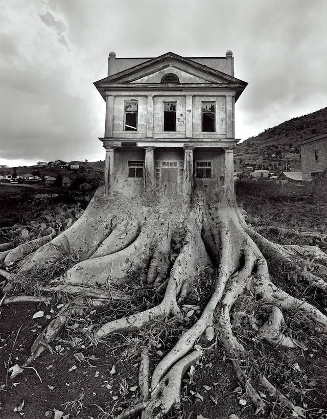
 On the second day of the photography we expanded our work on Photoshop by looking at the ways photographs could be layered and edited in order to re-contextualise them. This consisted off double exposure editing and selective layering. Also looking at the work of Jerry Uelsmann whose photography takes on a surreal feel as he warps images of natural forms with man made objects.  In this Photoshop session resulted in using different tools in the Photoshop tool bar, the first technique I explored was using the lasso select tool to select a section of the image to remove and to insert another one of the photos I took in its place. I chose to use the image of Rowan in the window as I thought by altering the background of the window it would appear as if the door was a gateway to another place. I first had to select the part of the image I wanted to remove.
I next had to select an image that I wanted to layer behind Rowans head. I chose an image taken of an A2 art students as it had quite a surreal feel and would make it appear that Rowan is somewhere else looking to the audience making them wonder where she's looking from. To insert the image you had to copy and paste the picture from another tab on Photoshop and then go to Edit > paste special > paste into. This would make the image paste into the section I had previously selected with the lasso tool.
 The next style of photo I decided to work in the style of was double exposure layering two photos and changing the opacity of the image to create the idea of a different background. I used the image I previously mentioned when talking about rule of thirds with the boot on a wet pavement paired with an image of a droplet of water on a bush in college as if the boot was walking in a forest. To do this I had to drag and drop the image of the bush onto the top of the image of the boot as a new layer.
 The next stage was to use the tool which makes a separate layer on the second image to make sure the editing is non destructive to the image below. Taking the paintbrush tool in black with the second section of the layer selected I removed the layer of the bush on top of the boot to make the boot prominent within the image. Doing this both the texture of the foliage and the original texture of the gravel can be seen making for a more successful image as it links with the themes of texture i had been exploring in my work within the studio.

The last technique I decided to explore was to create a reflection in a window of one of my images using the same process as before. I first needed to crop the image then layer this over the window image.


lighting definitions

High key lighting
adjective
1: (of a photograph) having cheifly light tones, usually with little tonal contrast. 

Low key lighting 
adjective
1: (of a photograph) having cheifly dark tones, usually with high contrast.    

Saturday, 2 January 2016

Working on a larger scale.

Acrylic experiments on a larger scale working with inspiration of Peter Brüning. 


After experimenting in my small sketchbook with the ways in which acrylic can be applied to the page to create an abstract style which was inspired by sections of Brüning's 'Onhe titel'. I applied the acrylic to the page with ripped pieces of cardboard, by doing this it allowed the paint to drag across the page in a rectangular manner. The rough texture of the cardboard removed some of the paint underneath and blended it with the colours being added to the surface, it also allowed for washes of colour to be added over the top of the work. As the cardboard became saturated with paint, colours began to merge and create new hues, this meant after a certain period of time using the same piece of cardboard you have to use a new section. This in effect means to create a larger scale image a lot of cardboard is used through the process, to create a similar effect a pallet knife could be used, as the edges of the knife mimic the nature of the cardboard. I completed a few of these smaller scale images, with the red image seen above turning out to be the most successful due to the high contrast between the darker brown shades and the vibrant red. 


The first stage of the stretch, size A1.
 
It was at this point I decided to complete an image on a larger scale. Firstly choosing to work A1 as this is the largest size available to me, this would also allow for a more expressive style of work. When making a stretch the paper must damped with a sponge and laid on the board. Working quickly damp gum tape must be added to each side of the paper applied with a lot of pressure to ensure a tight stretch. When the paper dries it should be tightly stretched onto the board making it easier to work onto paper that doesn't crease or move. I did find that when I was applying a layer of emulsion to the page as a base and to add texture the paper bubbled and when it dried there were slight creases, I put this down to a poor stretch as it was the first time id ever done this style of work. 


After letting the base of emulsion dry I started to work into the piece with acrylic and cardboard in the same style as in my smaller sketchbook. Working on a larger scale allowed the marks I made to be a lot more expressive as I had further to go on the page. Through working with different marks I learned different combinations of marks that I thought made  for a satisfying image. By dragging a thick amount of paint vertically across the image then taking the side of the cardboard across this made an almost tree like figure. Working with this as a main aspect of the piece I ended up developing a piece that had its main bulk at the centre of the page then these sharp spikes of colour extending the piece further from the middle. 


The final outcome of this image.
After completing the main two thirds of the image I decided that this image could relate to the theme of faded and traces with the transition of colours from mainly dark hues with a compact and dense composition. At the other end of the image a brighter and less dense area of paint. In this way the idea of a once strong memory fades into a less prominent memory which may get altered over time as you recount it, here shown with the changing of colours. When completing this image I feel I could have made this message stronger if I had added complementary colours which if I completed this style of image again I would add complementary colours to make a more vibrant image. I particularly like how this image mimics an explosion however I did feel that when the gum tape was removed from the board, the blank space left where the tape was made the piece look awkwardly placed on the page. To counter act this I took a scalpel and trimmed the edges of the page as close as I could to the areas of colour, this made the composition of the piece slightly better as the image seemed to fill the area of the paper. 


As the theme I was exploring before i looked at abstract expressionism was texture applying a base of emulsion to my stretch made for a vast amount of texture on the papers surface. By using cardboard rather than a brush to apply to paint it made areas of built up paint creating almost ripples in the paint. By taking a clay tool to areas of the paint when it had dried it allowed me to remove some of the paint creating a rough texture which contrasted with the smooth ripples created by thick acrylic. I was initially going to work back into this piece with glue and acetate like what i had been experimenting with previously in my sketchbook however I was happy with the way this piece looked without the addition of more texture. However I plan to complete another larger scale piece and work back into it with different mediums. 


Over the holidays I didn't have to ability to complete larger pieces on board and so i could only paint smaller paintings on A3 sketchbook paper. It was then I understood how much having the paper stretched to board helped. Painting onto paper that wasn't attached to anything made it difficult to get the same type of fluid motion without the paper ripping, using different paper also meant that my paper was saturated and became hard to work on. However I did explore the use of colour more in these pieces, using complementary colours such as purple and green, this made the image slightly more vibrant. The acrylic paints I used weren't as high quality as the ones I used at college which also took away from the colours used in the image. I do not think that this image was as successful as the previous image, however I do think the use of complementary colours aided the overall image even if outcome wasn't as successful. 
 
I plan to complete more larger scale images and plan to mix media to add to the overall texture of the images. I also want to make the images more personal to me as these two pieces weren't based on any particular emotion or memory and I feel that if I focused on a specific event it might aid the overall effect of the piece.